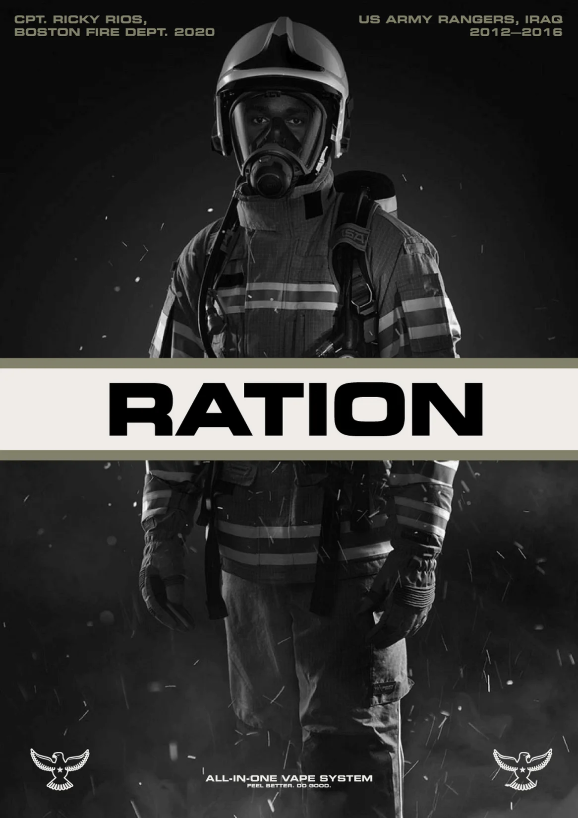
Ration Ration is the cannabis brand redefining what it means to serve


Problem
The cannabis market is crowded with lifestyle brands, but few stand for anything meaningful. Ration was built with a clear mission—to support America’s modern heroes—but lacked a brand system strong enough to communicate that purpose at scale. They needed a visual and strategic foundation that could honor the tradition behind the name, celebrate service, and stand out in a highly regulated and visually noisy category.
Scope
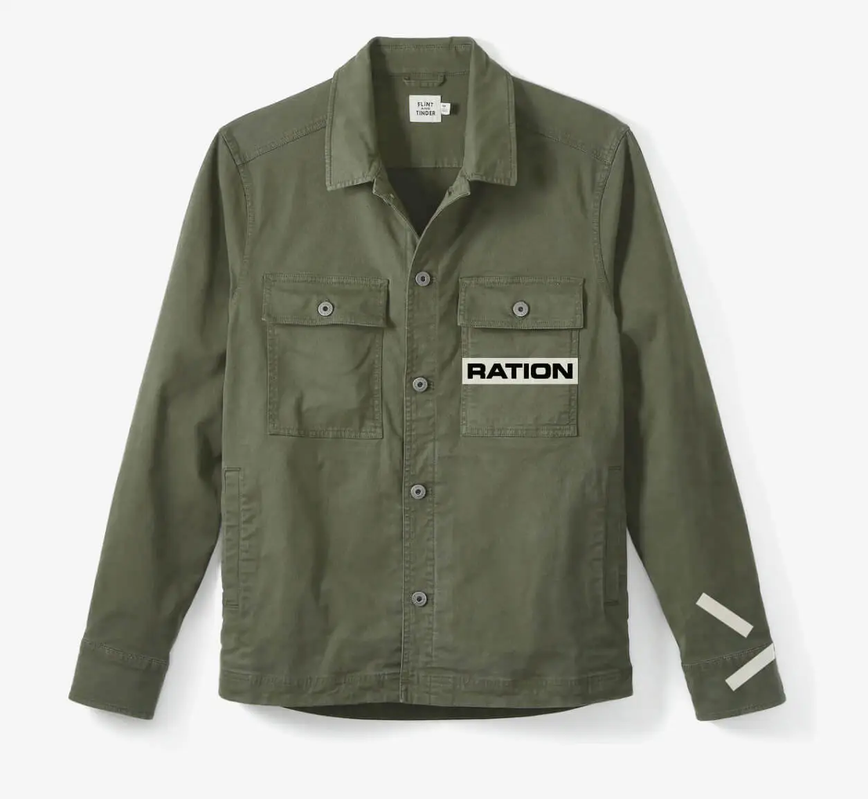
- Brand Identity
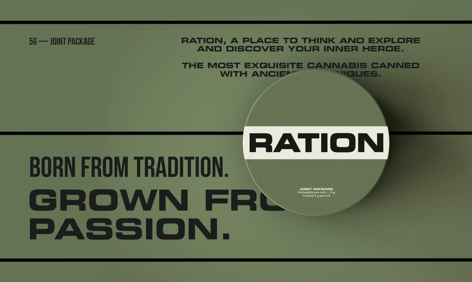
- Packaging
- Guidelines
- Website Design
Solution
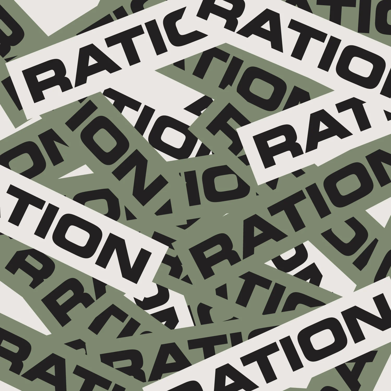
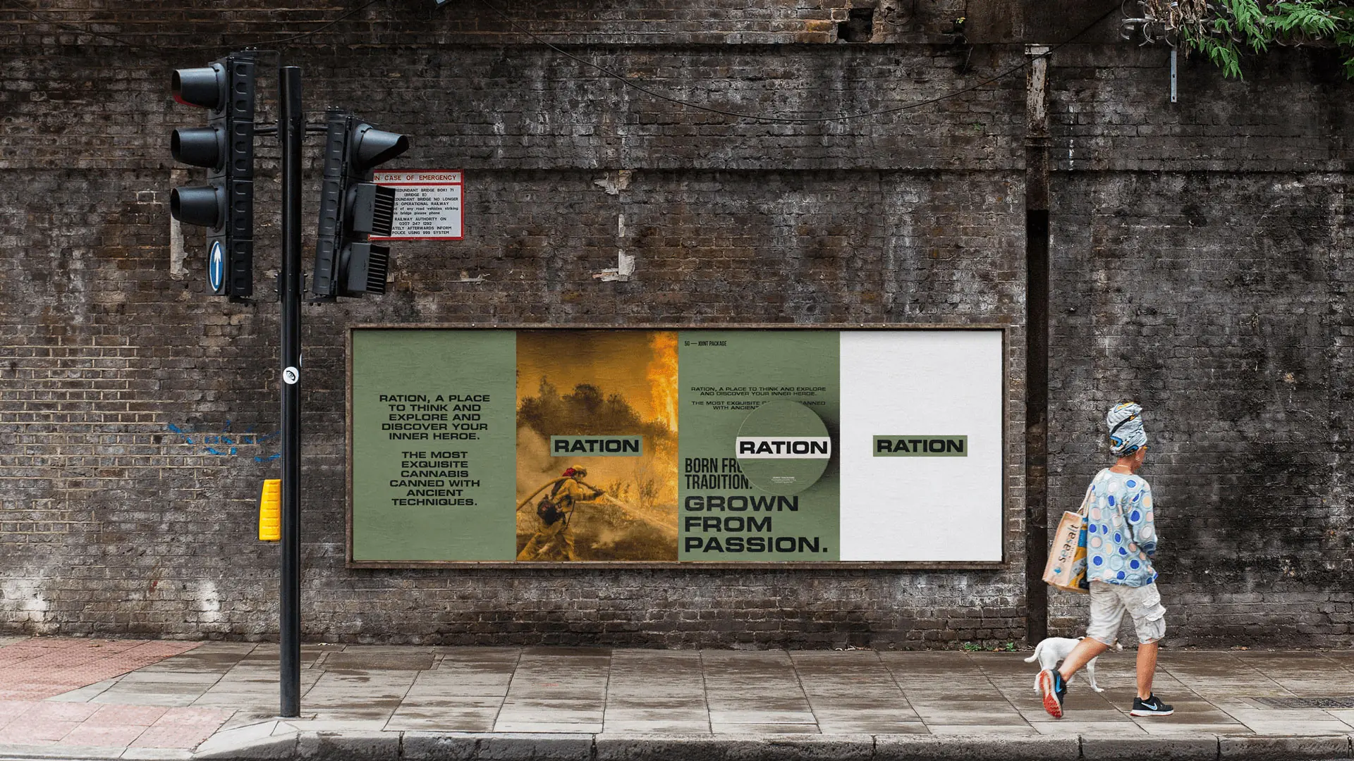
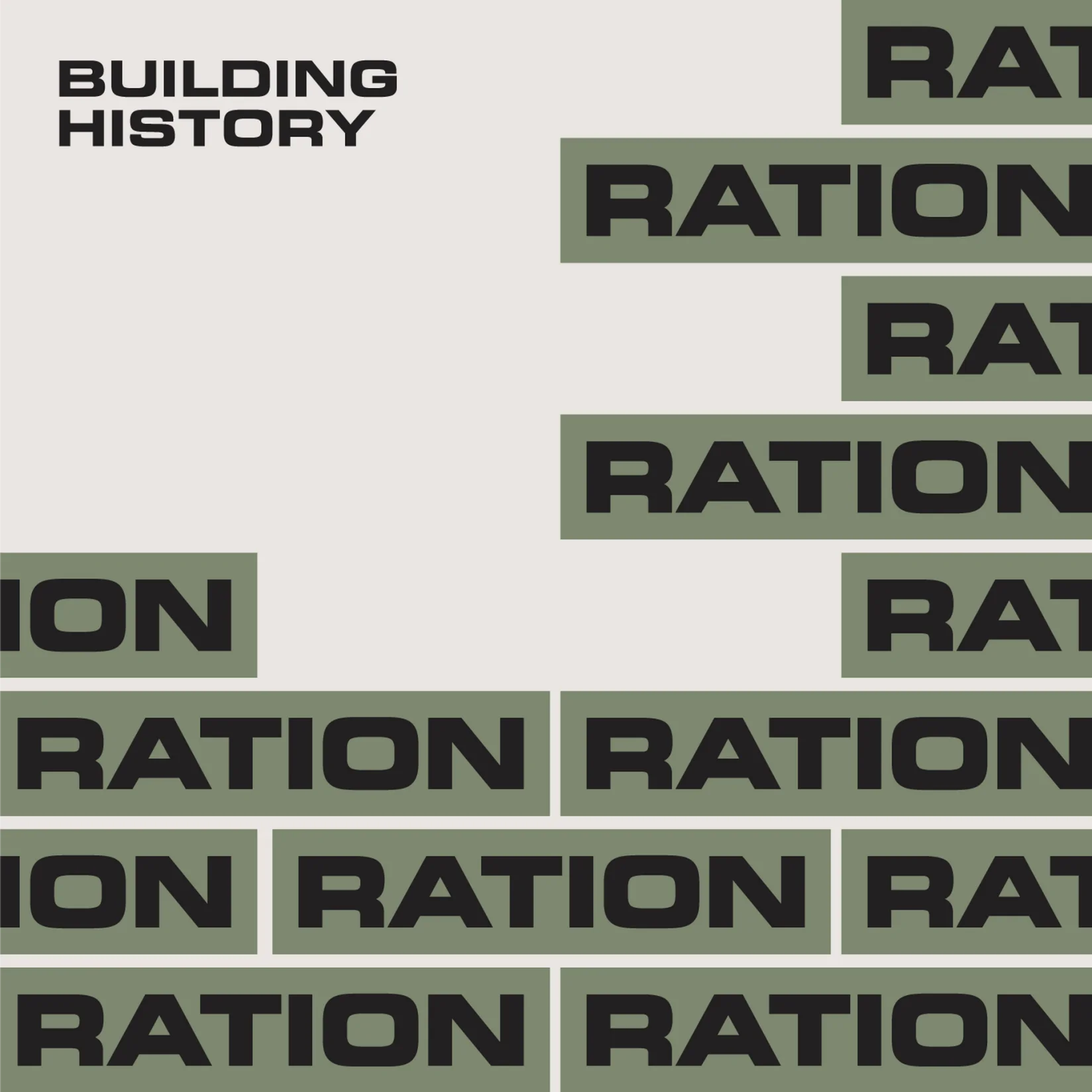
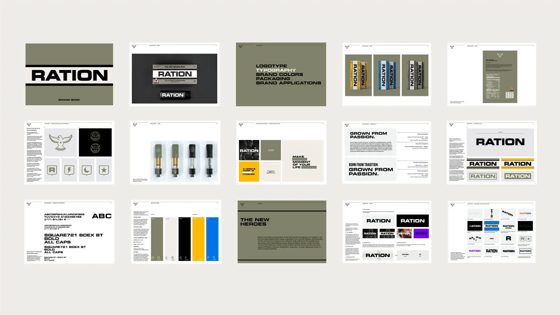
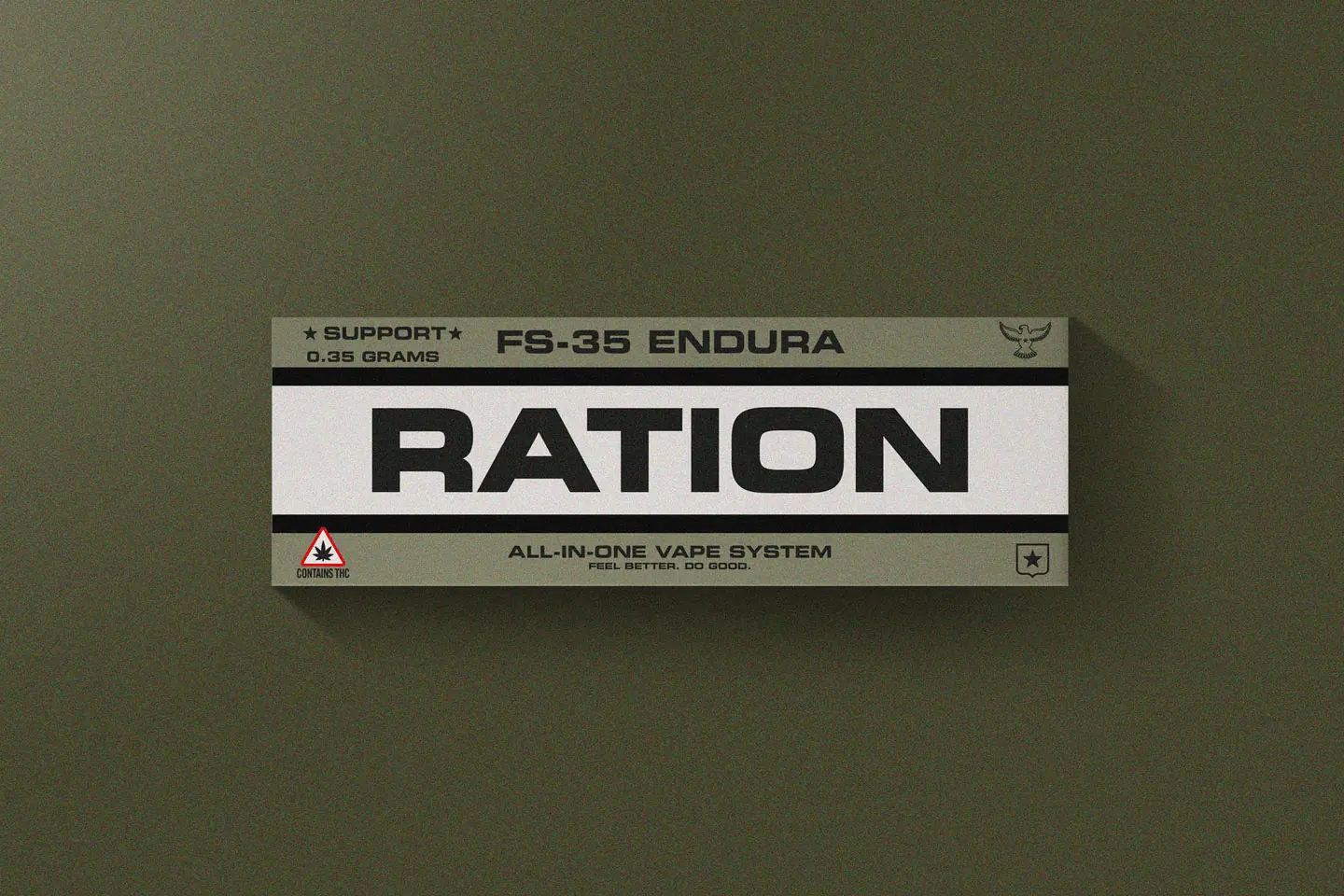
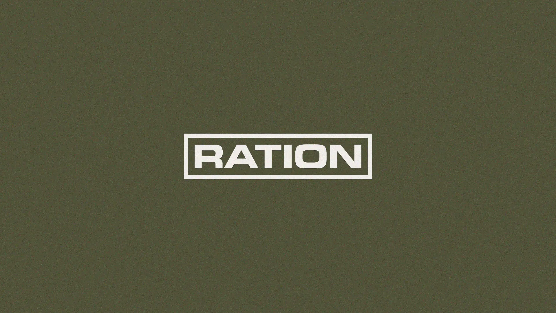
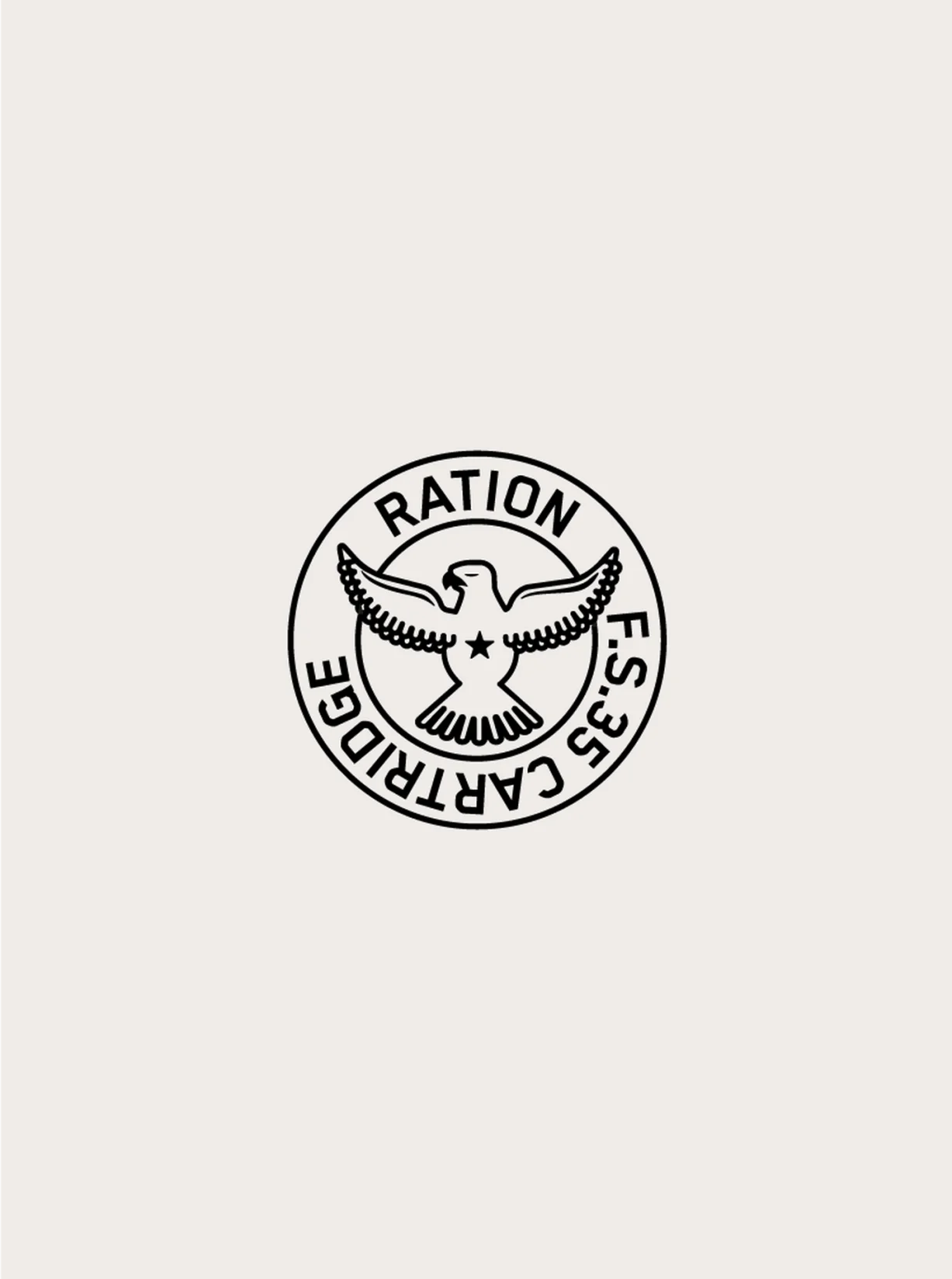
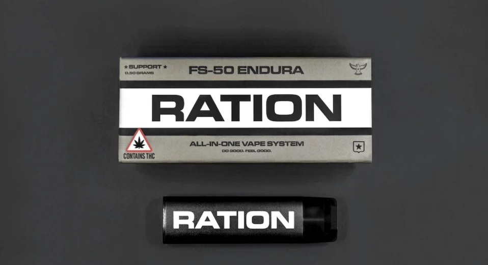
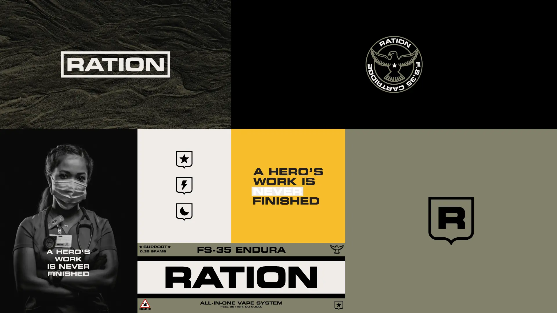
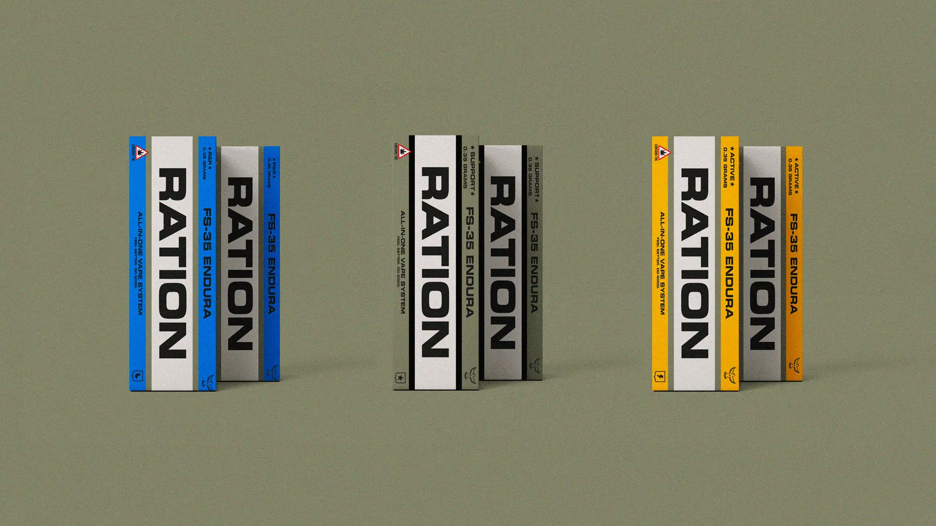
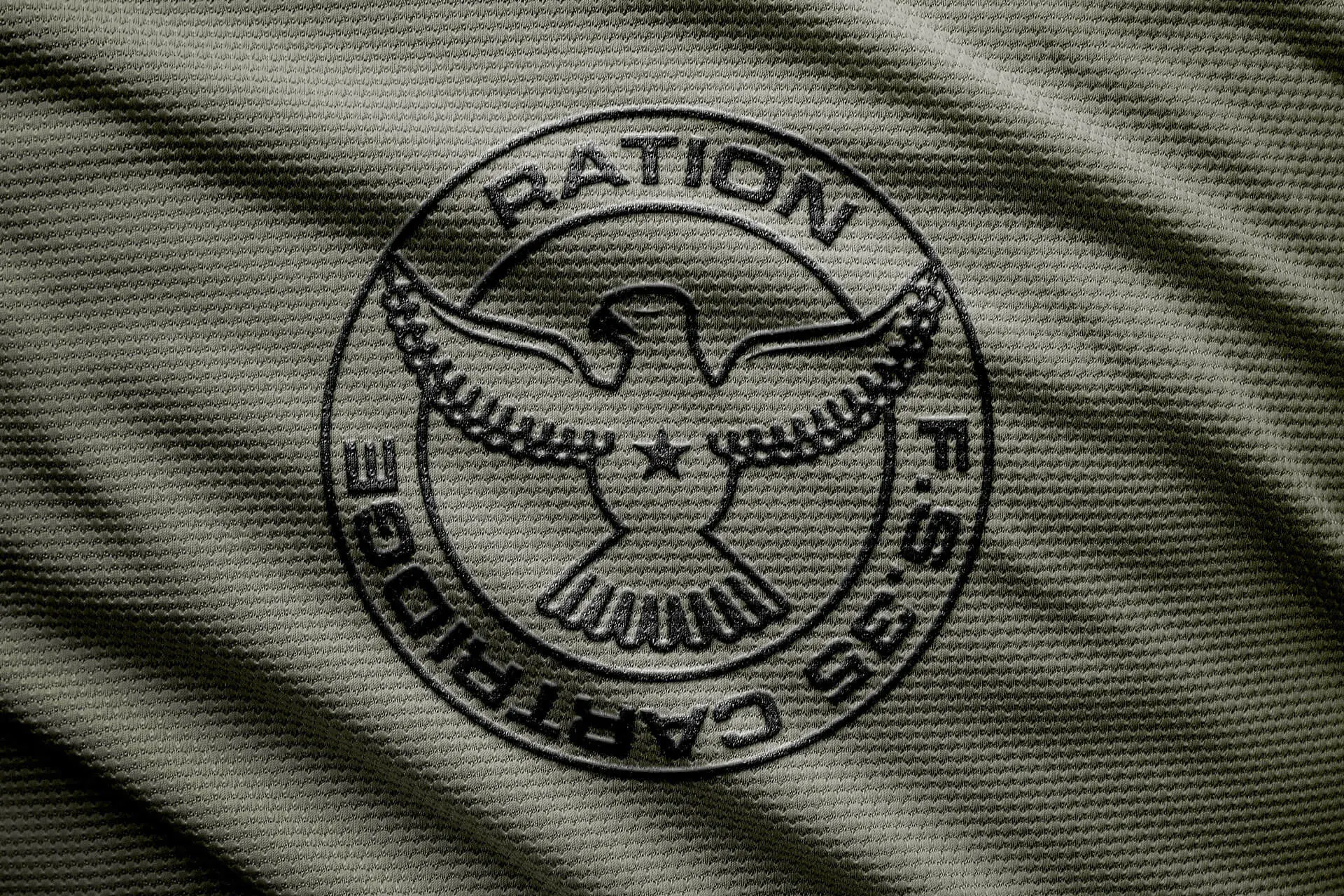
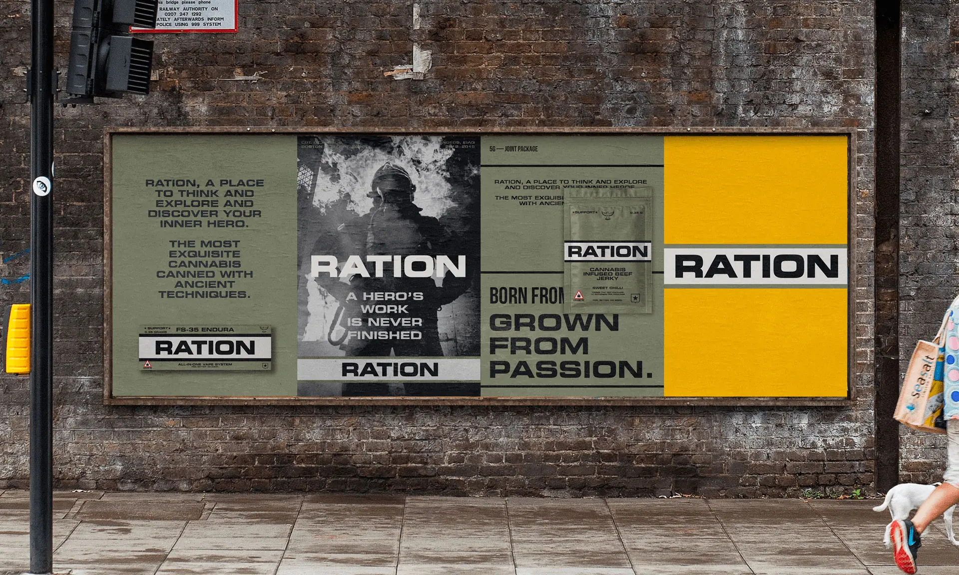
We built a brand that embodies service, strength, and gratitude. Drawing from military tradition and the design language of American heritage brands, we created a full identity system—including logotype, iconography, packaging, and messaging—that elevates Ration’s mission and modernizes its appeal. Every touchpoint reinforces the idea that “a hero’s work is never finished,” helping Ration connect emotionally with consumers while clearly communicating its commitment to donating 5% of net profits to organizations supporting veterans, first responders, nurses, teachers, and more.
Press

Born & Bred is a fantastic branding agency. They know how to get inside your head and help you tell/show the world who you really are.