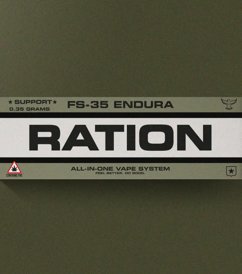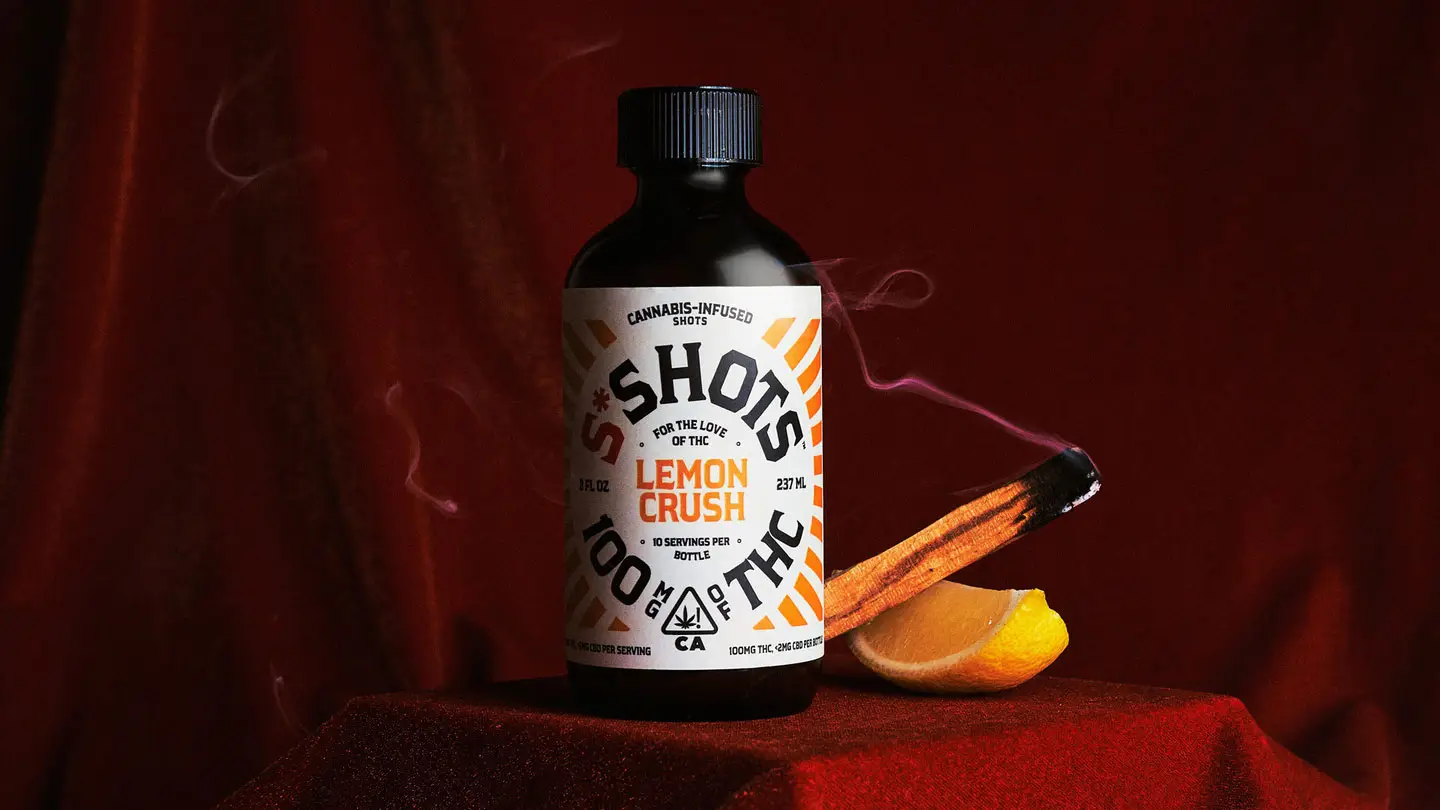
S*Shots Branding That Hits as Hard as the Product


Problem
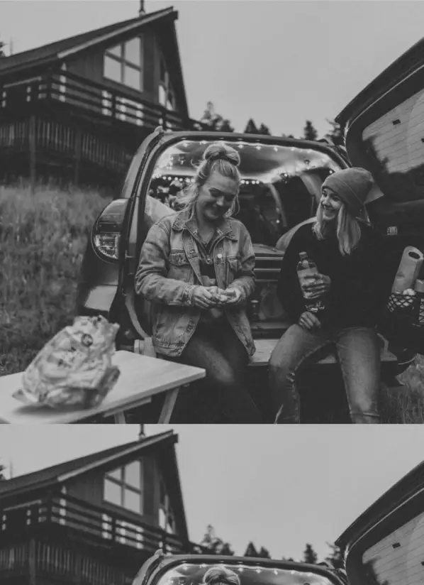
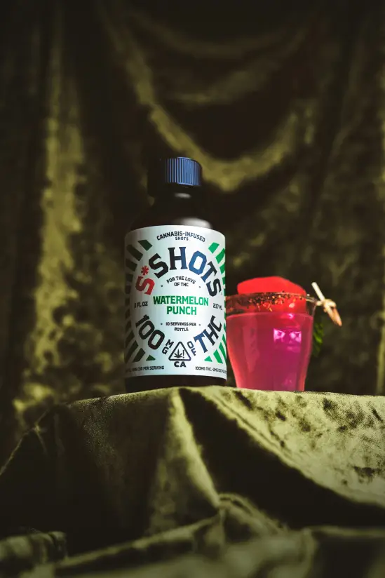
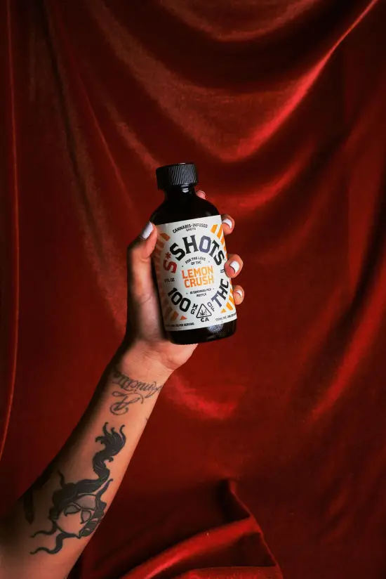
S*Shots had a potent product, but the brand was missing its mark. Built like a wellness startup, it wasn’t resonating with the hardcore cannabis crowd, the ones who actually wanted to get high. They weren’t seeing themselves in the brand, and S*Shots was losing to edgier, more culturally in-tune competitors.
🔭
Scope
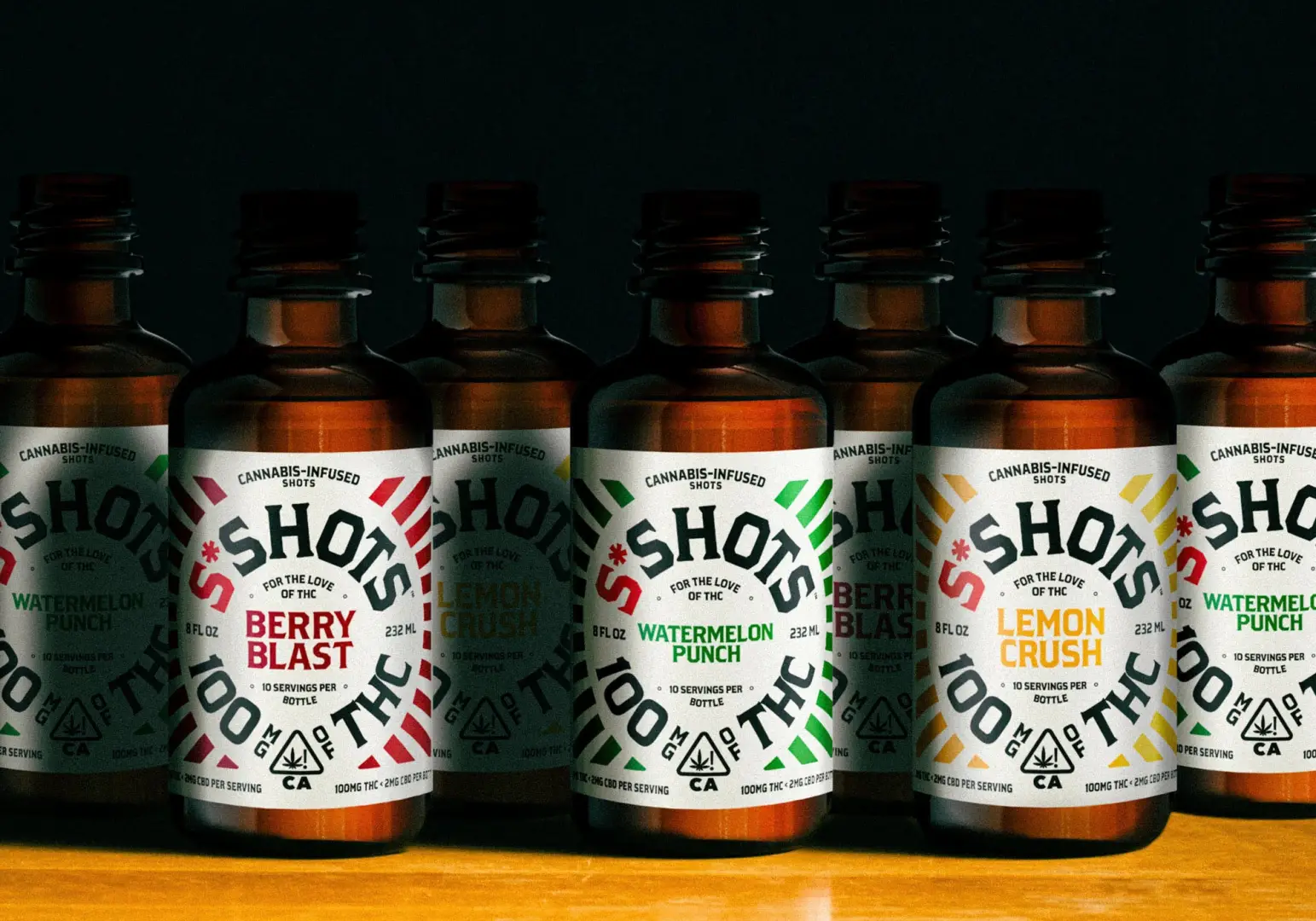
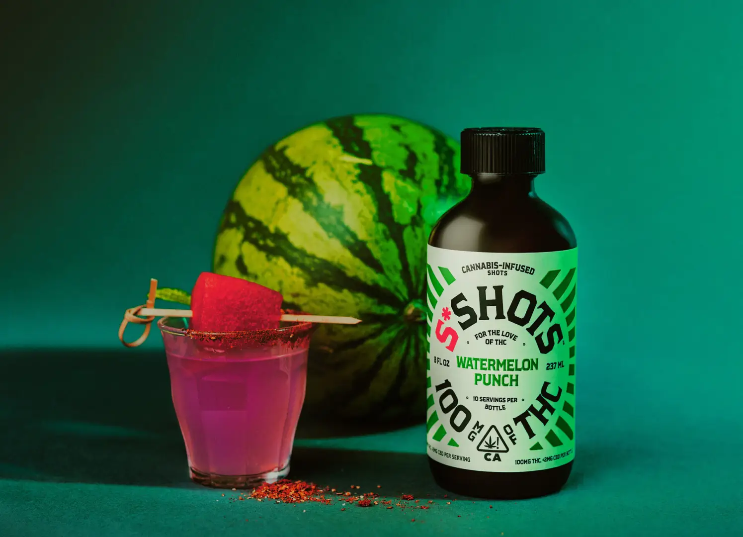
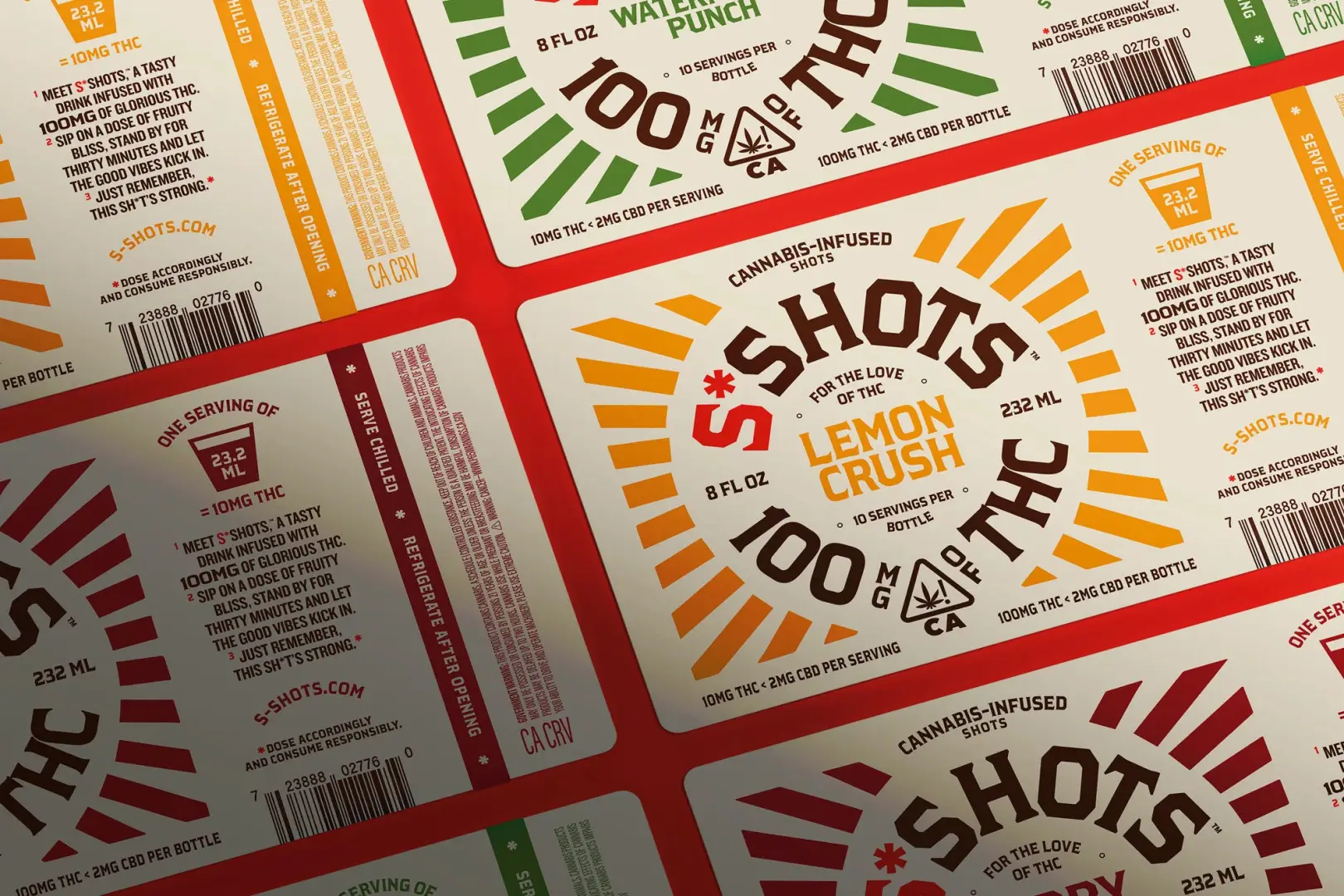
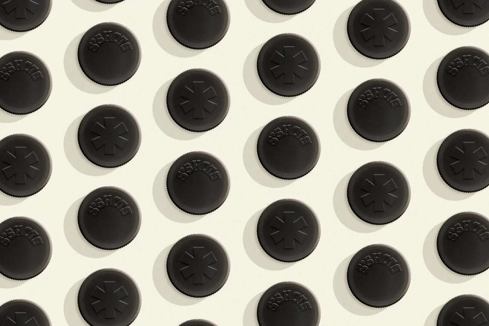
- Packaging
- Brand Identity
- Website Design
- Messaging
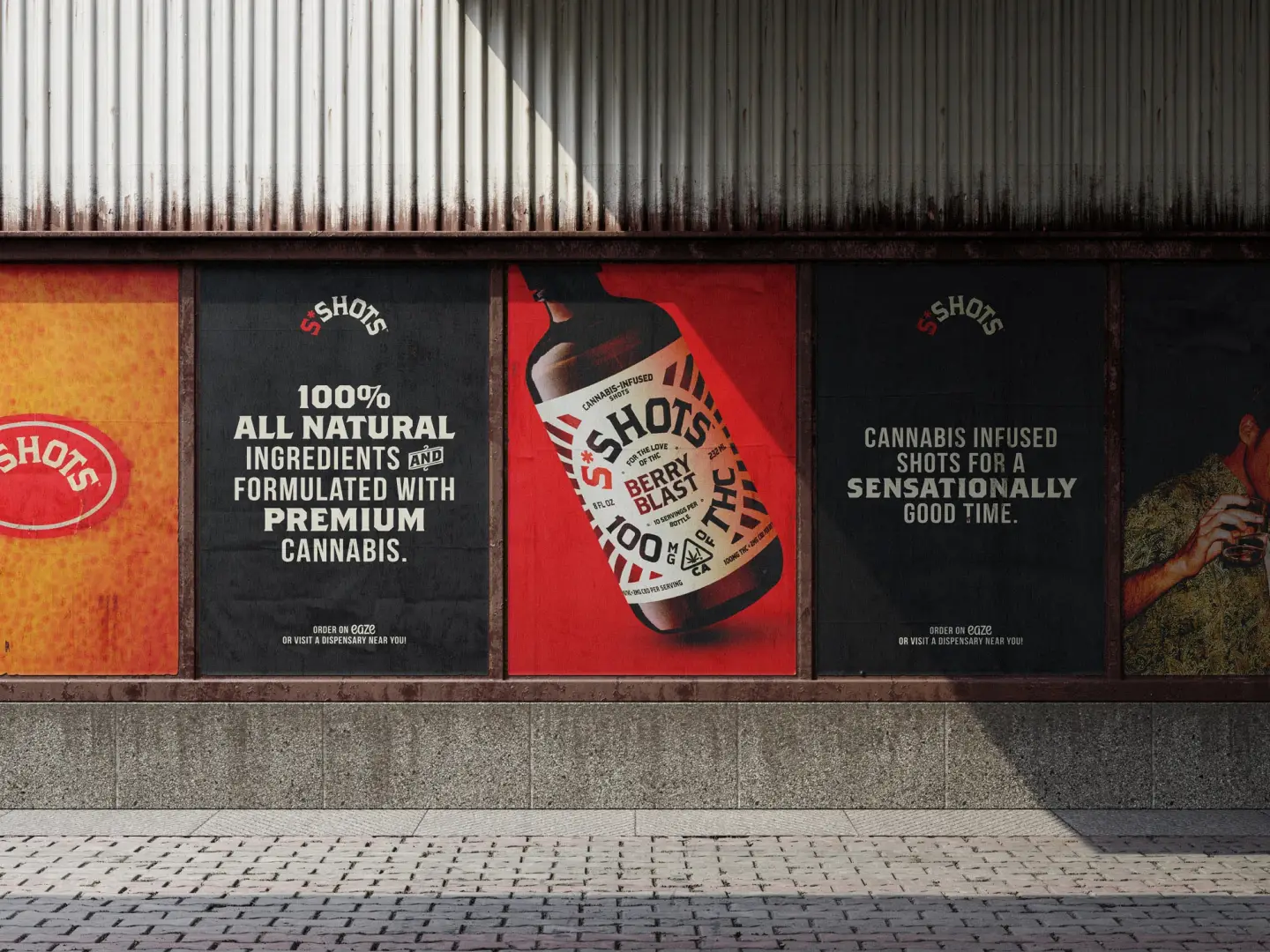
Solution
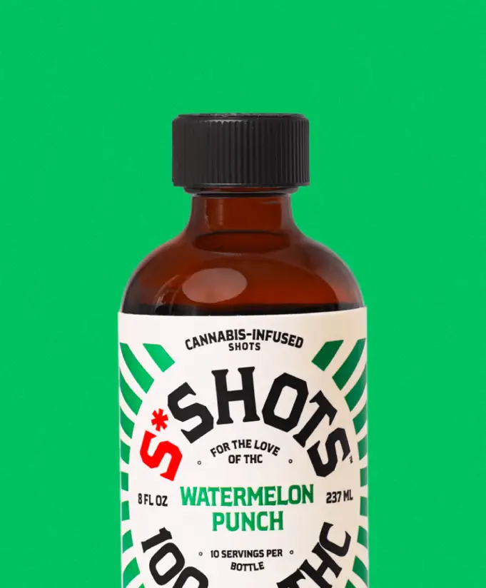
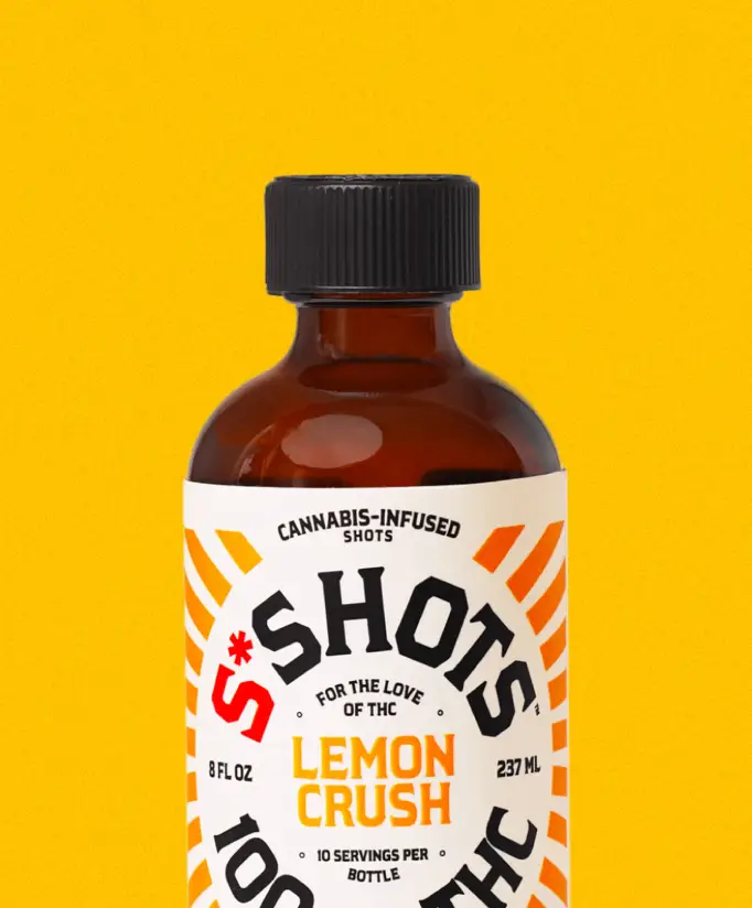
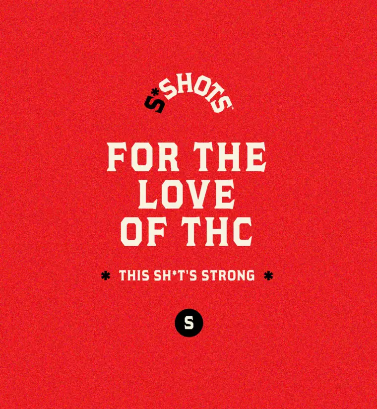
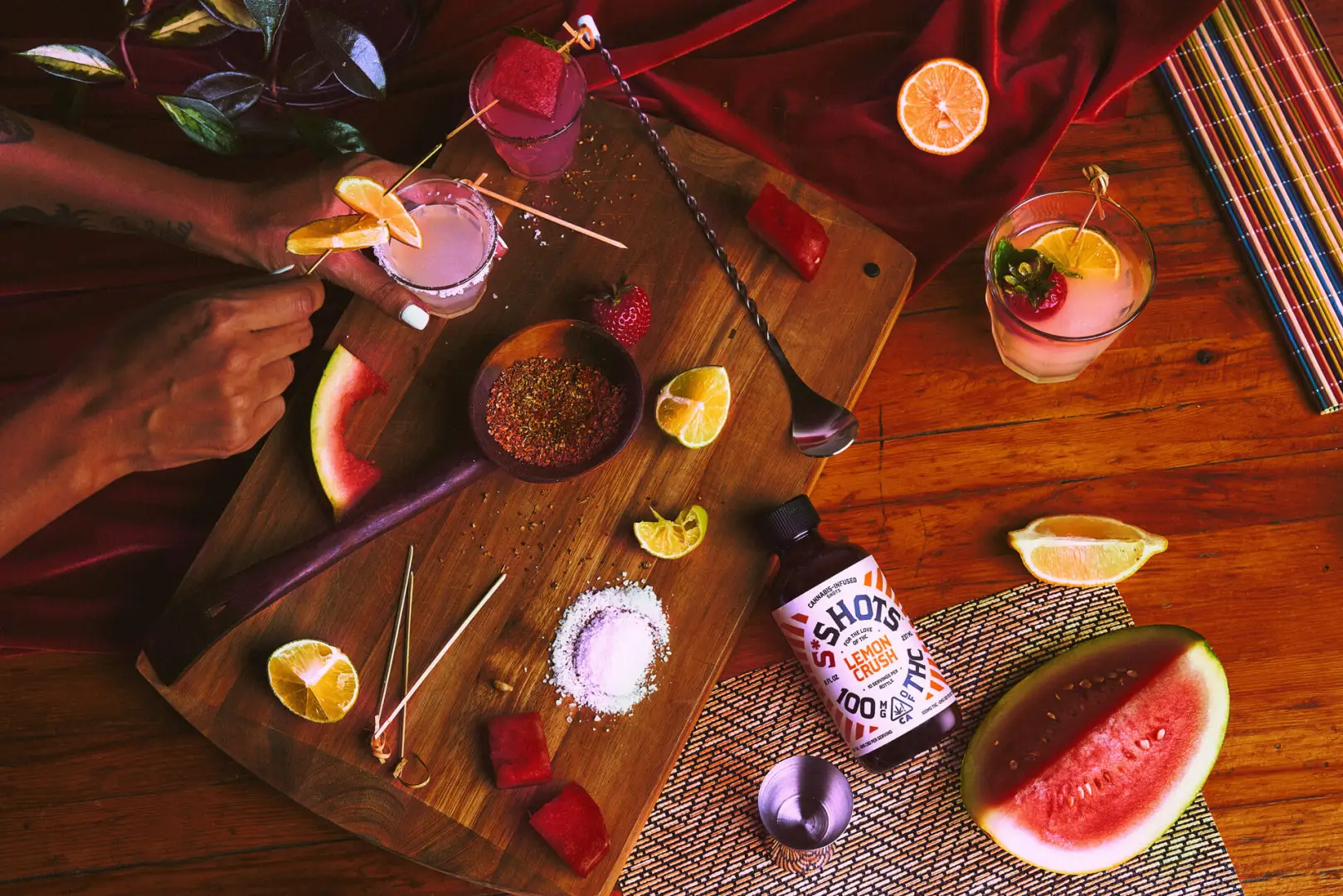
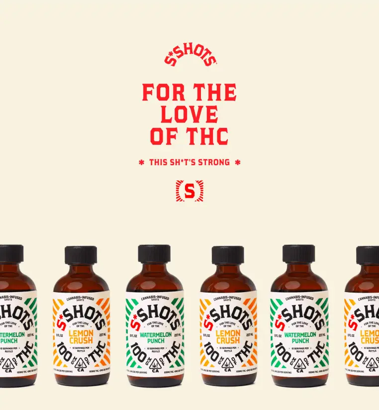
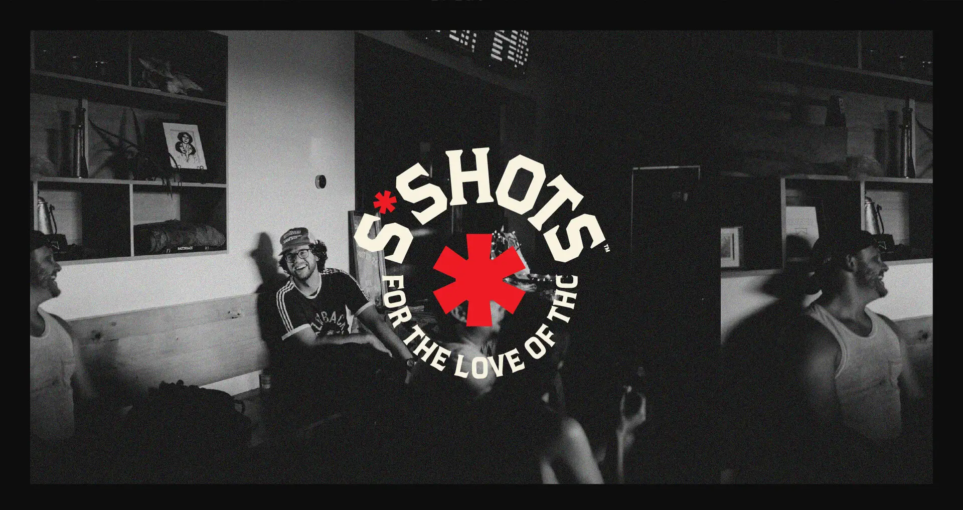
We scrapped the wellness act and leaned into weed culture. From the name to the attitude, we rebuilt the brand for people who take cannabis seriously, bold packaging, irreverent copy, and a tone that feels more sesh than science. S*Shots became “for the love of THC,” launching with a campaign that owned its strength and celebrated its community.