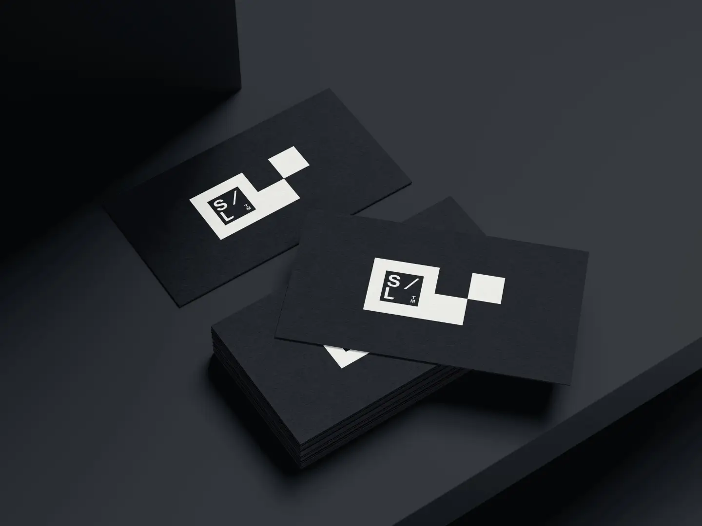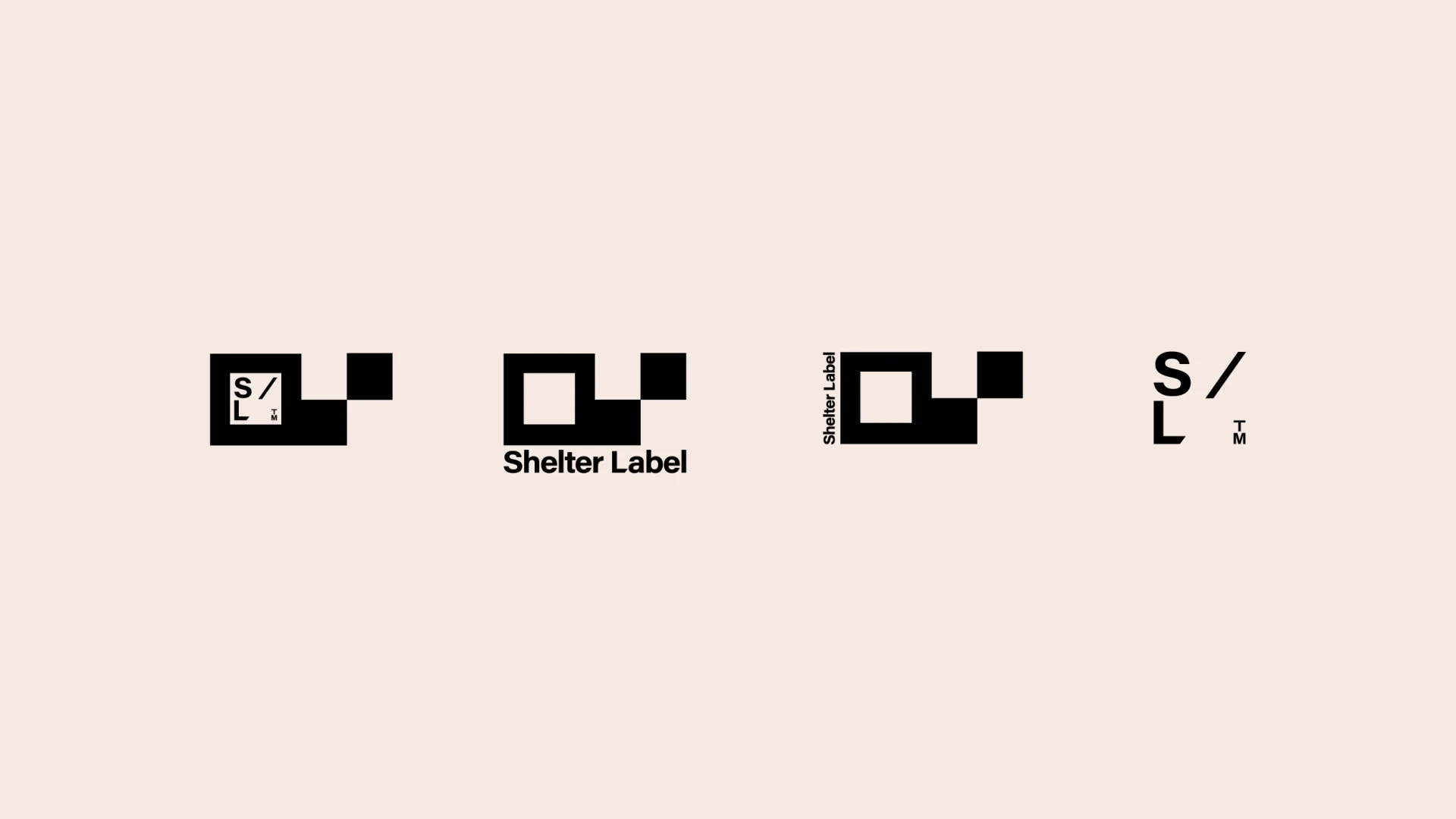
Shelter Label
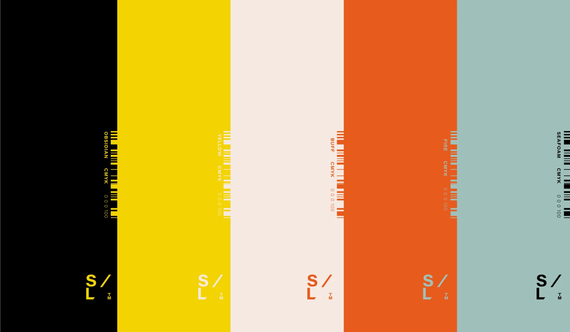
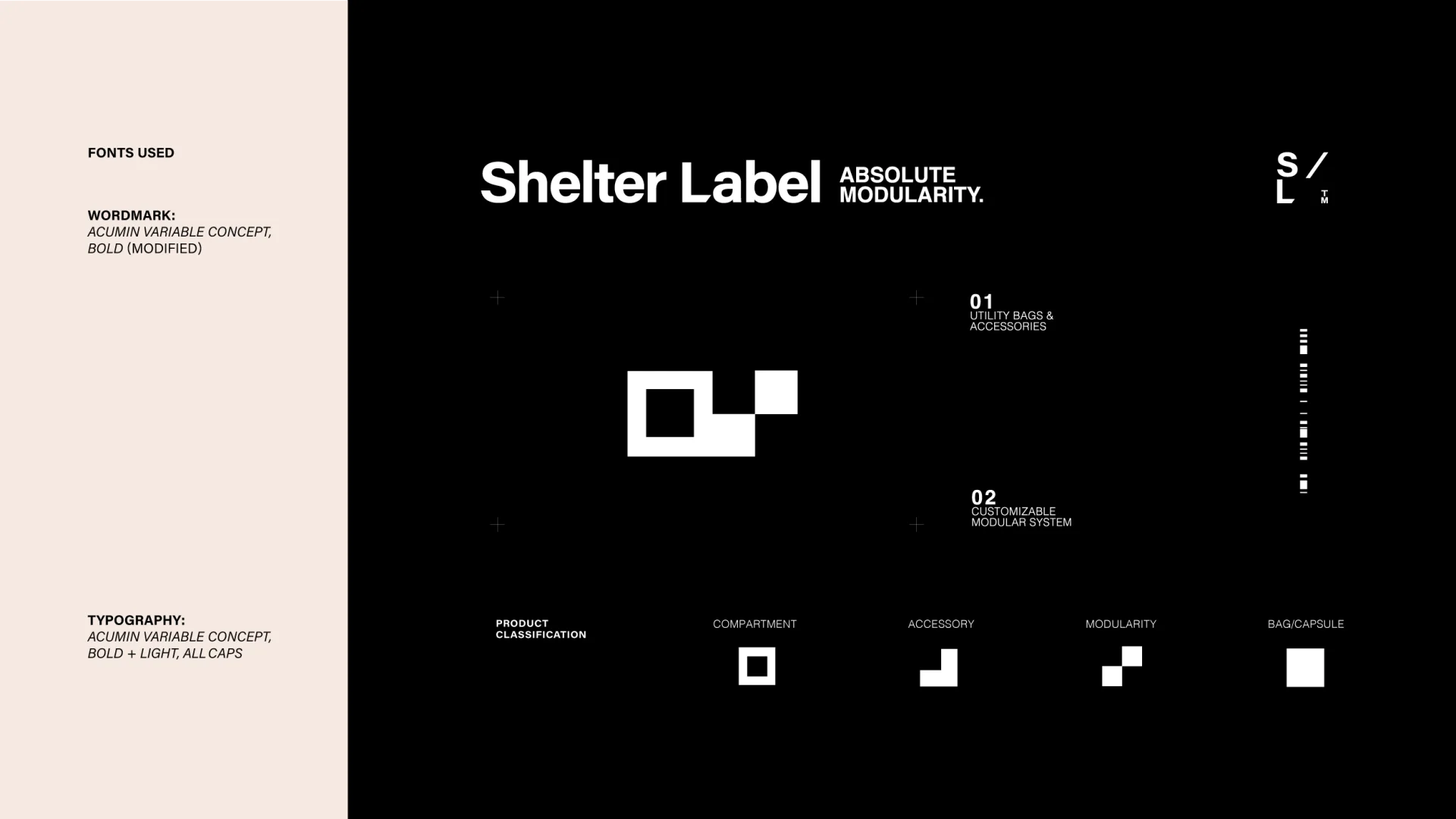
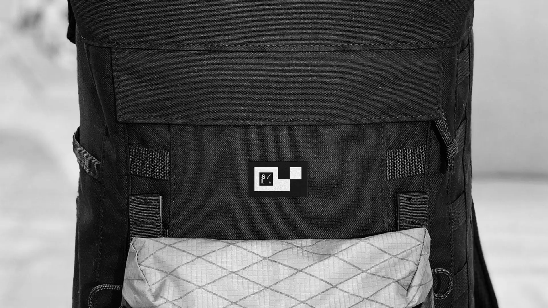
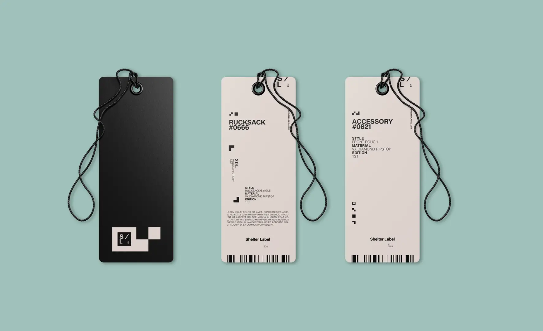
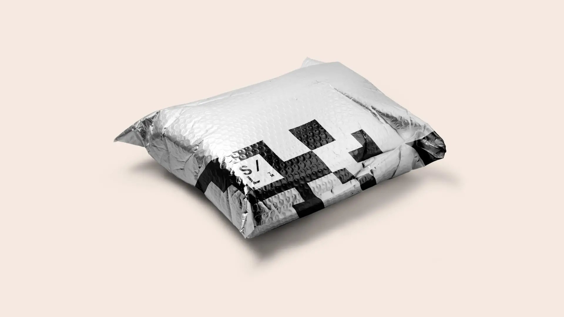
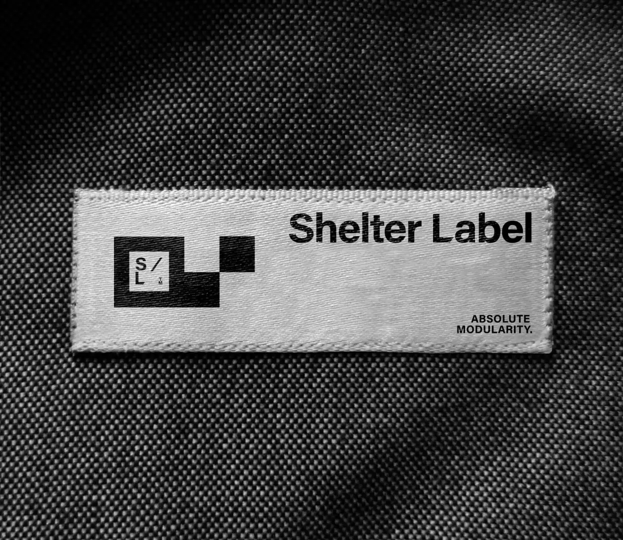
Shelter Label came to us with a very interesting request with an even more interesting product—modular utility bags with a strong attention to detail and an effortless complexity. With the ability to customize your very own bag for almost any activity, we knew we needed to create a brand system just as special. Inspired by the forward-thinking yet effortless aesthetic of Japanese streetwear, the durability of military garb, and the chill vibes of Socal (where the brand was created and housed) we hit all corners and supplied SL with an undeniably authentic brand.
Having been concocted by a creator with decades of utility bag design experience and carried by a partner with more mileage points than Santa Claus, Shelter Label was set to be the world’s next IT bag. But not just any bag, a bag that could potentially last an apocalyptic Armageddon all whilst making the carrier look good while doing so.
