Checkmate Securing the #1 spot in the App Store


Problem
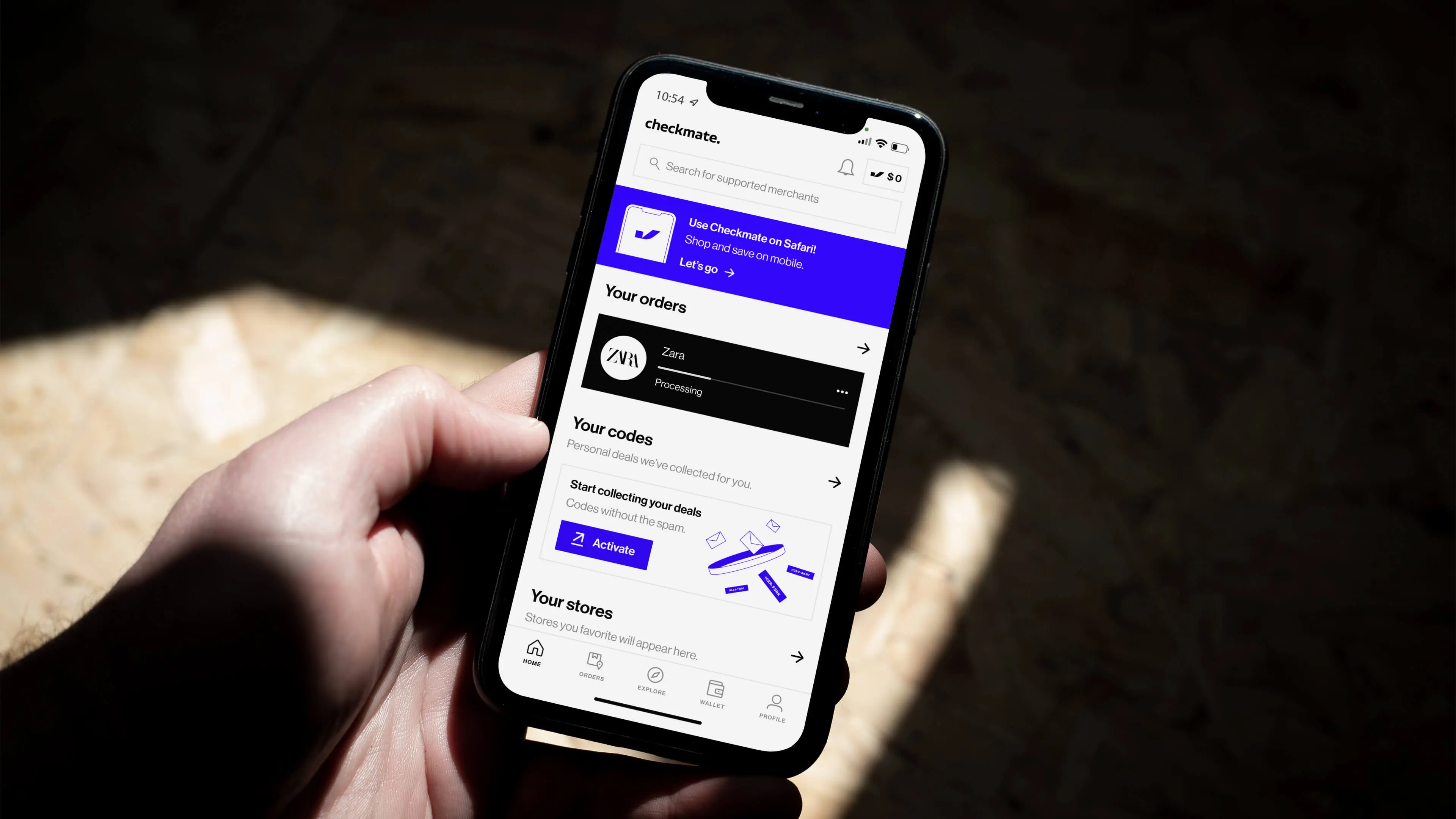
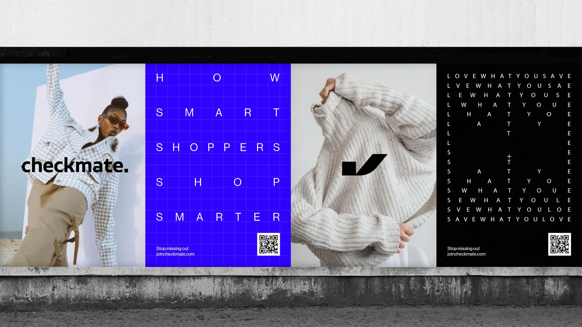
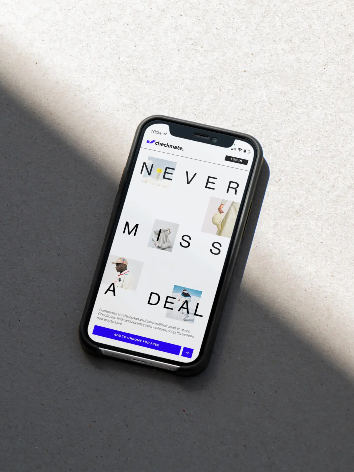
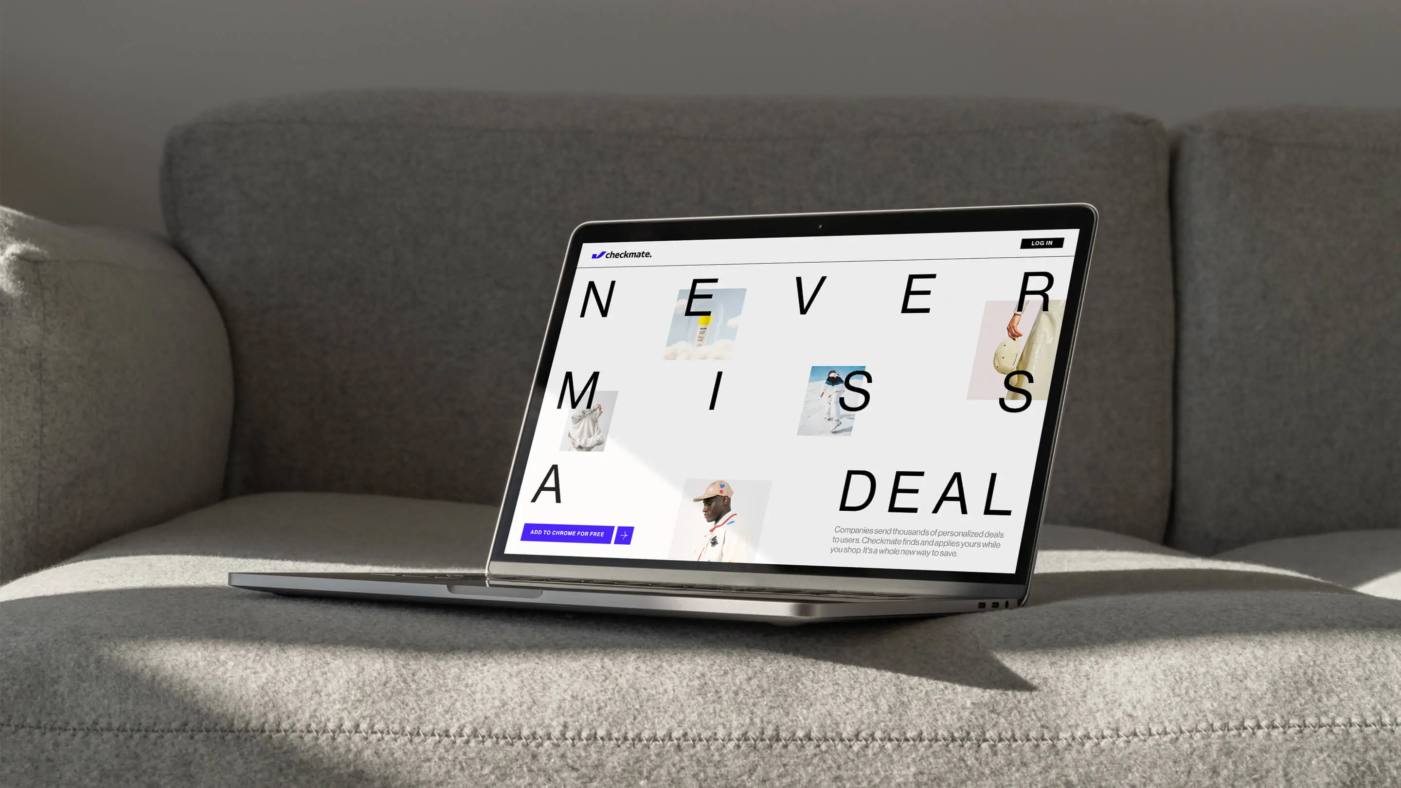
One of the biggest frustrations for online shoppers is paying more than they have to. Checkmate set out to solve this with a personalized tool that automatically finds the best discount codes — from inbox to internet — and applies them at checkout. But while the product delivered a seamless and intelligent user experience, the brand didn’t. The original identity lacked distinction, reliability, and modernity, making it hard to build trust or capture attention in a crowded market.
Scope
- Brand Strategy
- Visual Identity
- Messaging
- Website Design
- App Content
- Illustration
- Brand Guidelines
- Brand Assets
Solution
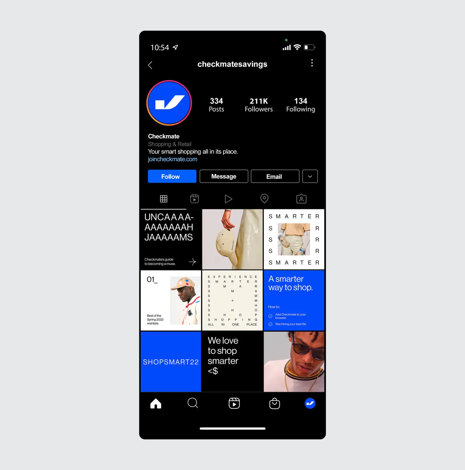
We partnered with Checkmate to build a brand that matched the product’s innovation and utility. Starting with strategy and messaging, we crafted a visual and verbal identity system that felt smart, modern, and trustworthy. The custom wordmark used strong geometric features to convey stability, while subtle curves in the “k” echoed the icon for a cohesive, ownable feel. We extended this language into illustrations, animations, and a dynamic web experience — all working together to enhance the user journey and reflect the ease of saving with Checkmate.
Client
- Harry Dixon
- Rory Garton-Smith
Results