Eatdirt Turning healthy eating into a brand with an edge


Problem
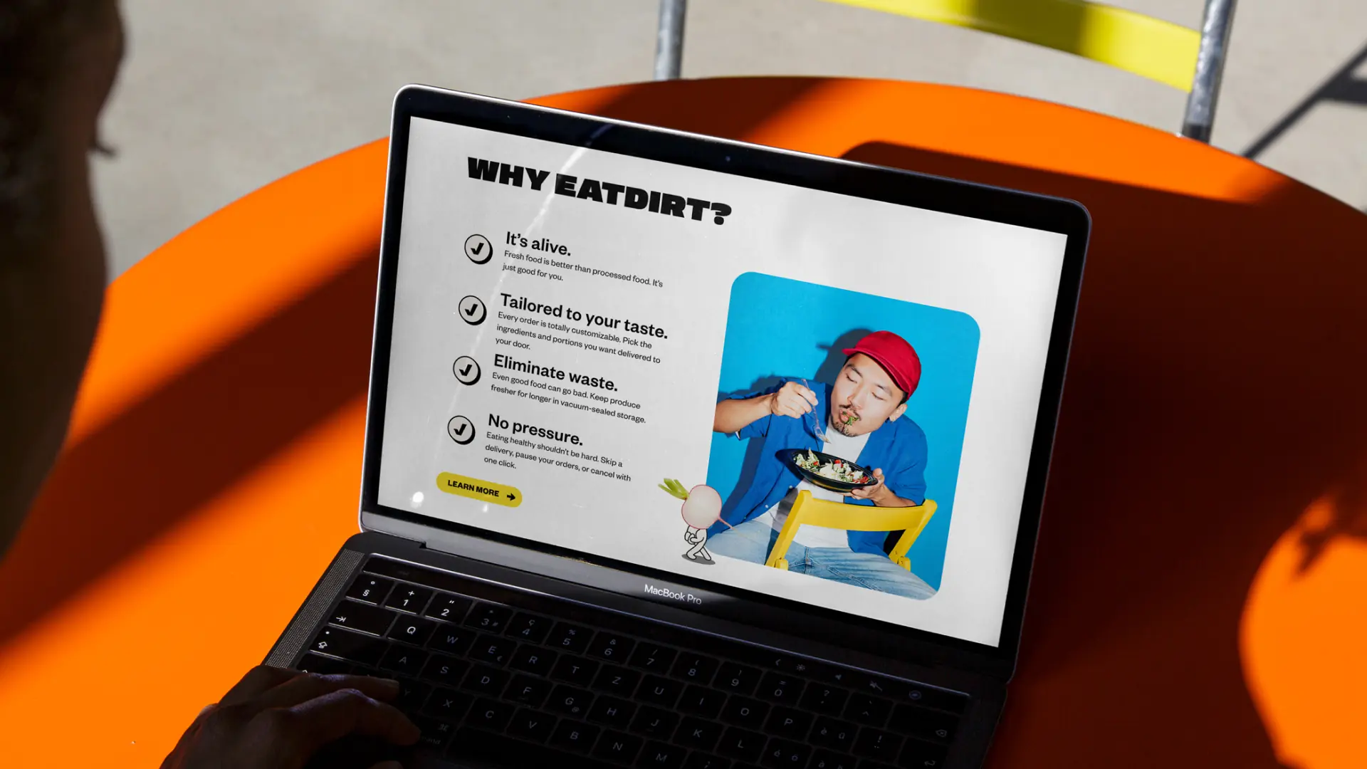
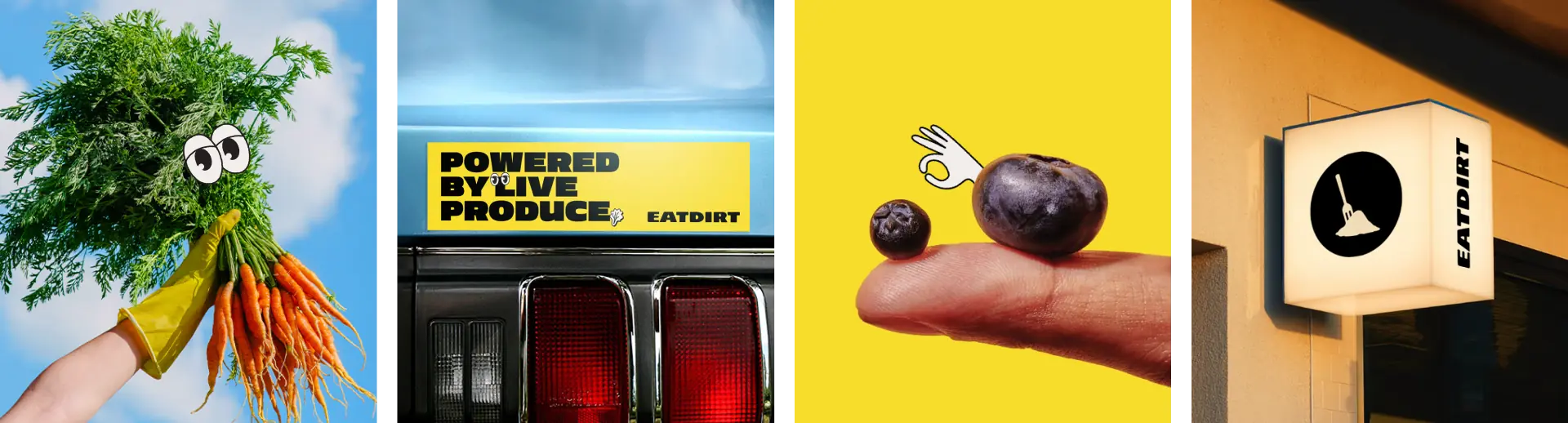
Healthy food brands tend to blend together. Clean fonts, muted palettes, safe language, and vague promises about “wellness” had turned the category into a sea of sameness. When EatDirt came to us as Glean, the product was strong, but the name and brand lacked personality, memorability, and cultural edge.
For EatDirt to succeed, the brand couldn’t just communicate nutrition, it had to stand out in a crowded market, feel human, and challenge how people think about eating healthy without sounding preachy or precious.
Scope
- Brand Strategy
- Naming
- Visual Identity
- Messaging
- Website Design
- Illustration
- Brand Guidelines
- Brand Assets
Solution
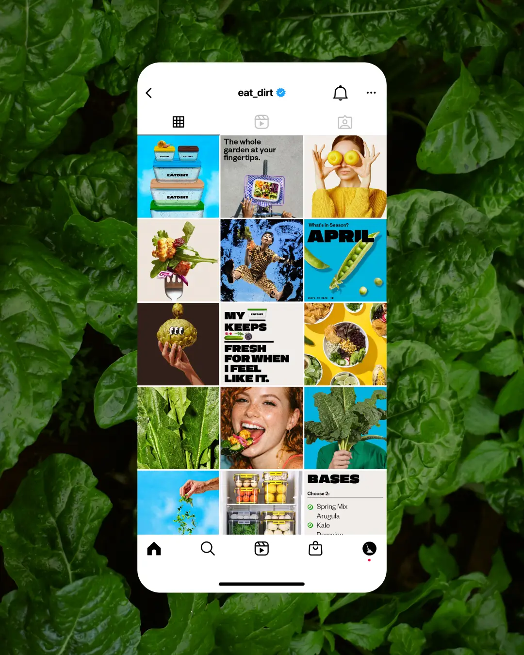
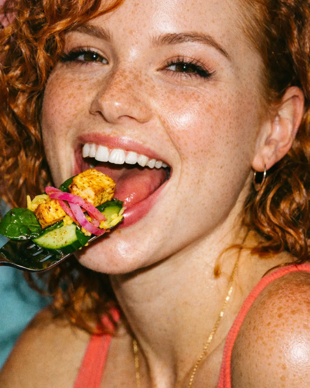
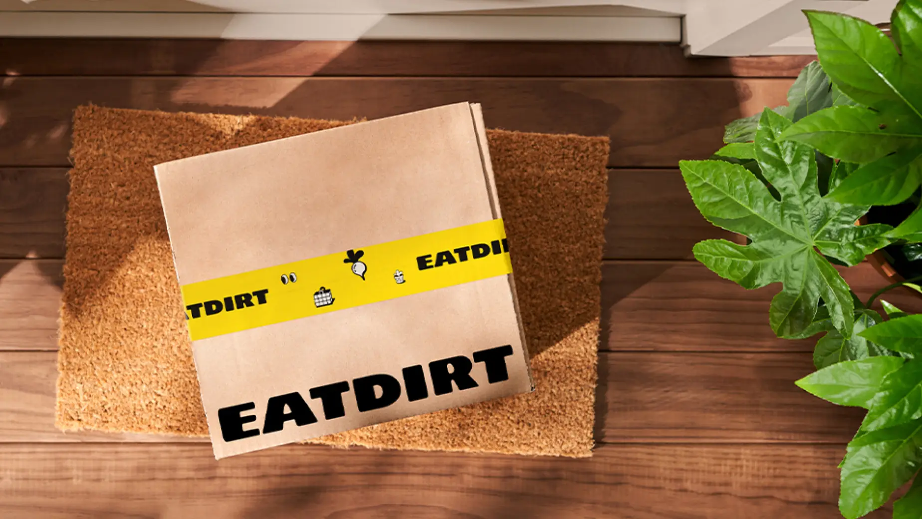
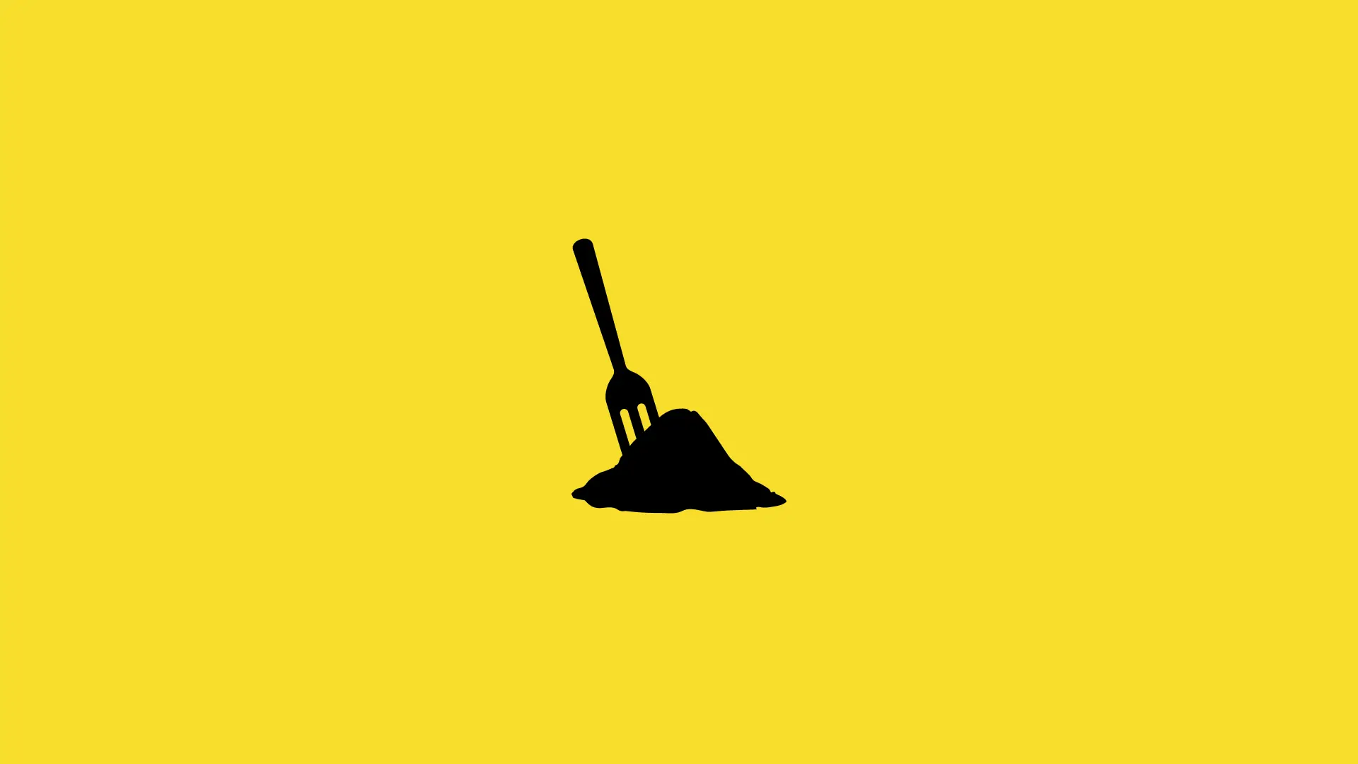
We renamed Glean to EatDirt, creating an unapologetic, irreverent brand built to disrupt the conventions of healthy food. From the name forward, EatDirt embraced boldness, owning the messiness, humor, and reality of eating well in real life.
We developed a full brand system for EatDirt, spanning strategy, identity, messaging, and digital execution. The result was a cohesive launch-ready brand that felt energetic, honest, and culturally fluent, one that made healthy eating feel accessible, fun, and worth paying attention to.
Client
- Marcus Schiller
- Norman W