Hi-Lyte Repositioning Hi-Lyte to win attention, and conversion, on Amazon


Problem
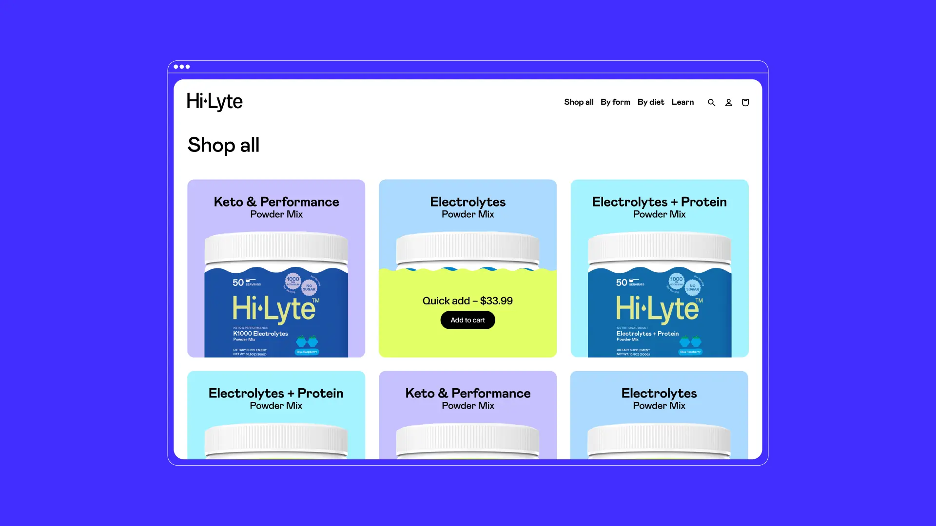
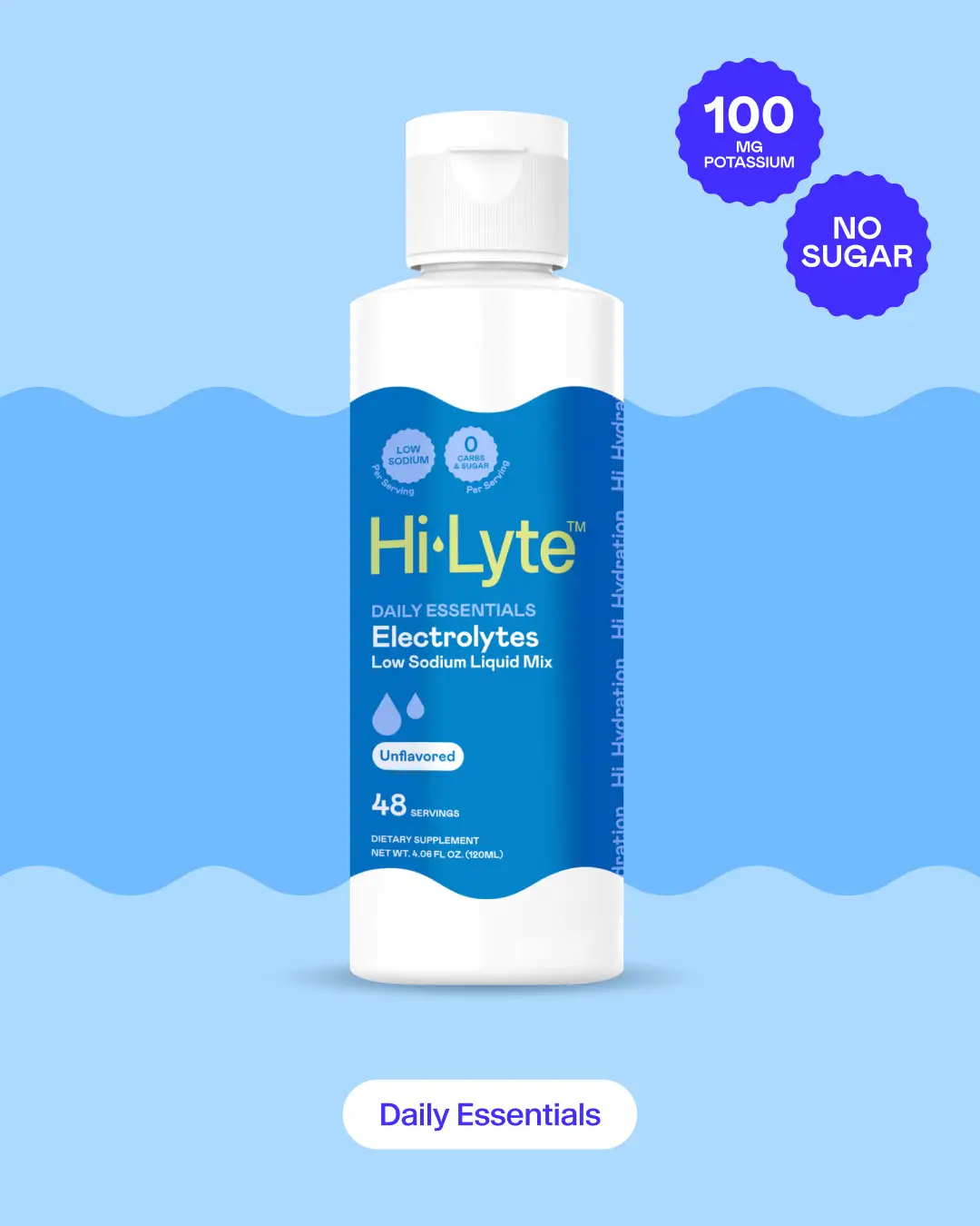
Hi-Lyte was competing in an overcrowded electrolyte category where most brands relied on sterile, clinical packaging. While effective, this visual language caused products to blend together on Amazon, making it difficult for Hi-Lyte to stand out or communicate clearly at a glance.
The brand needed to feel more consumer-friendly without losing the category credibility required to convert in a performance-driven marketplace.
Scope
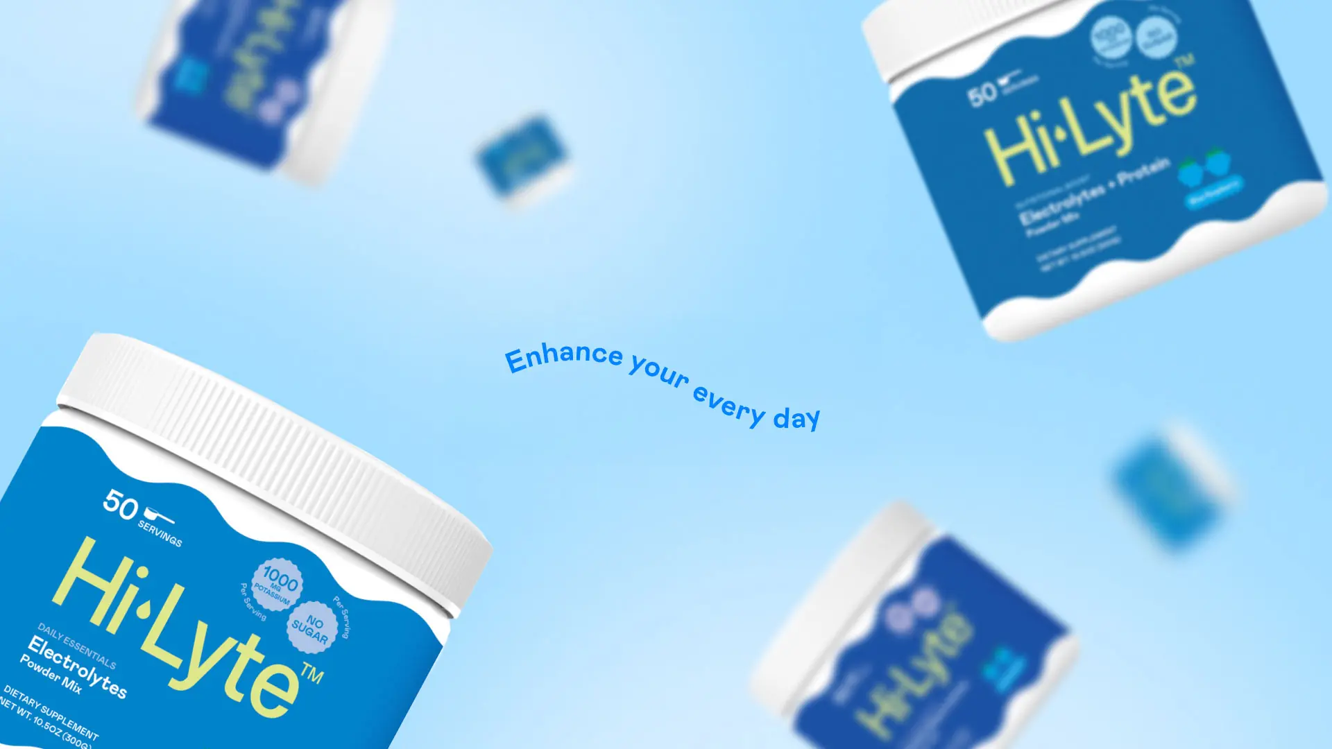
- Product Architecture
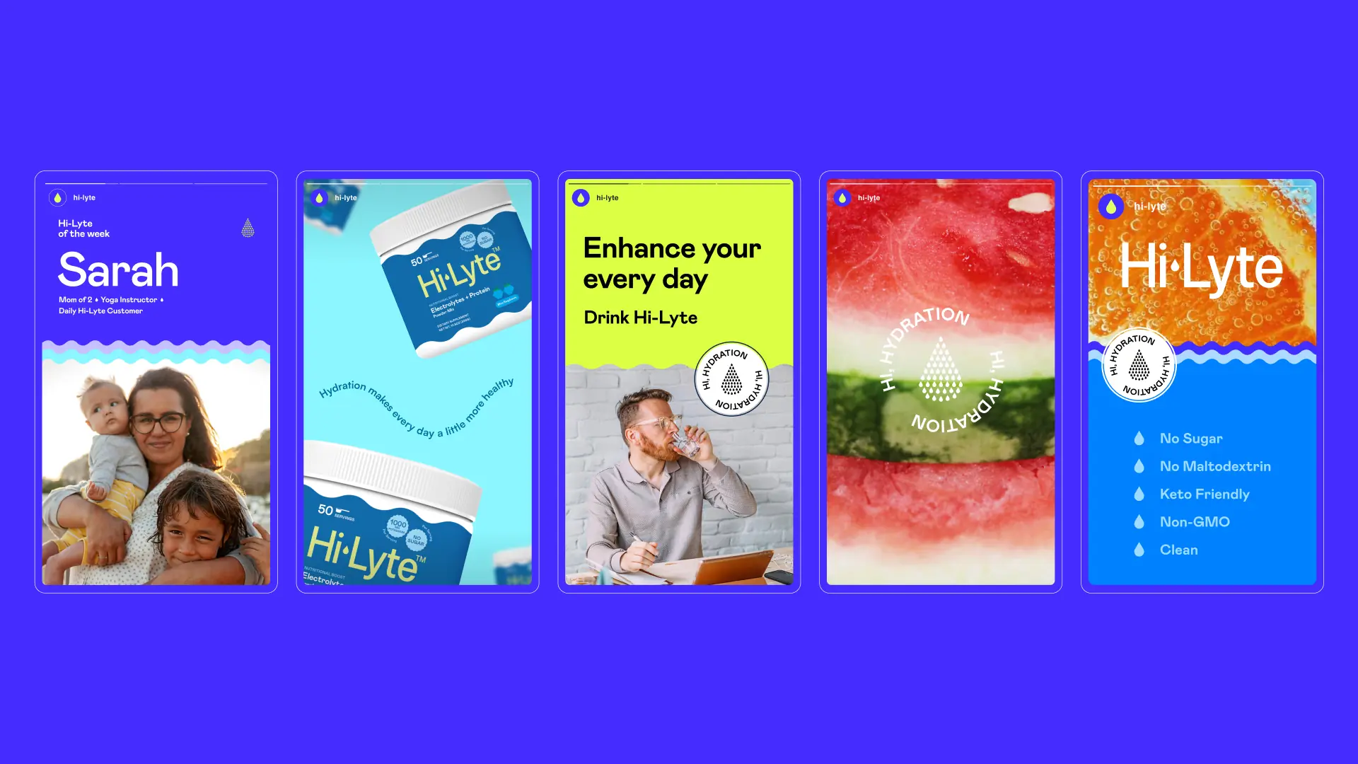
- Visual Identity
- Messaging
- Packaging Design
Solution
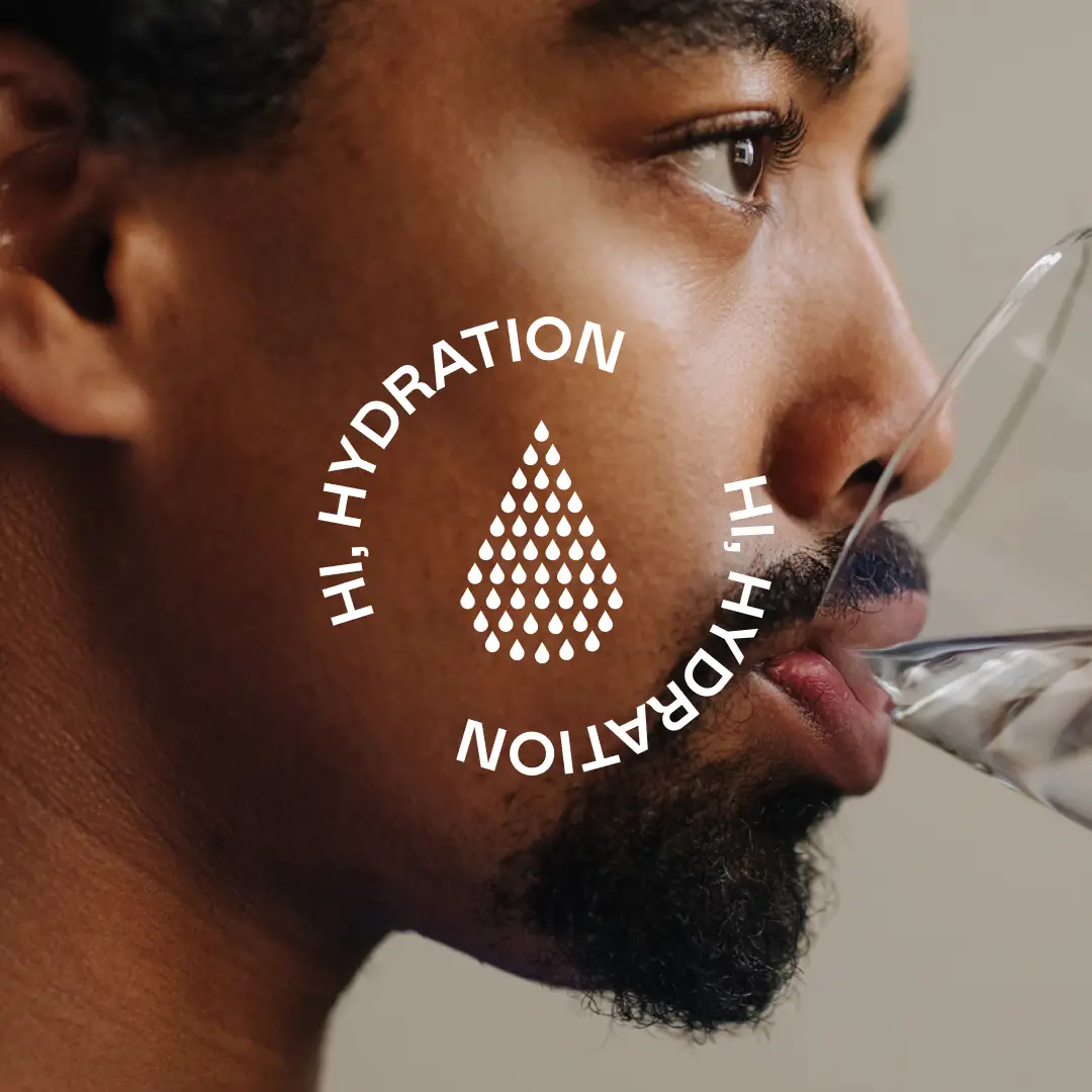
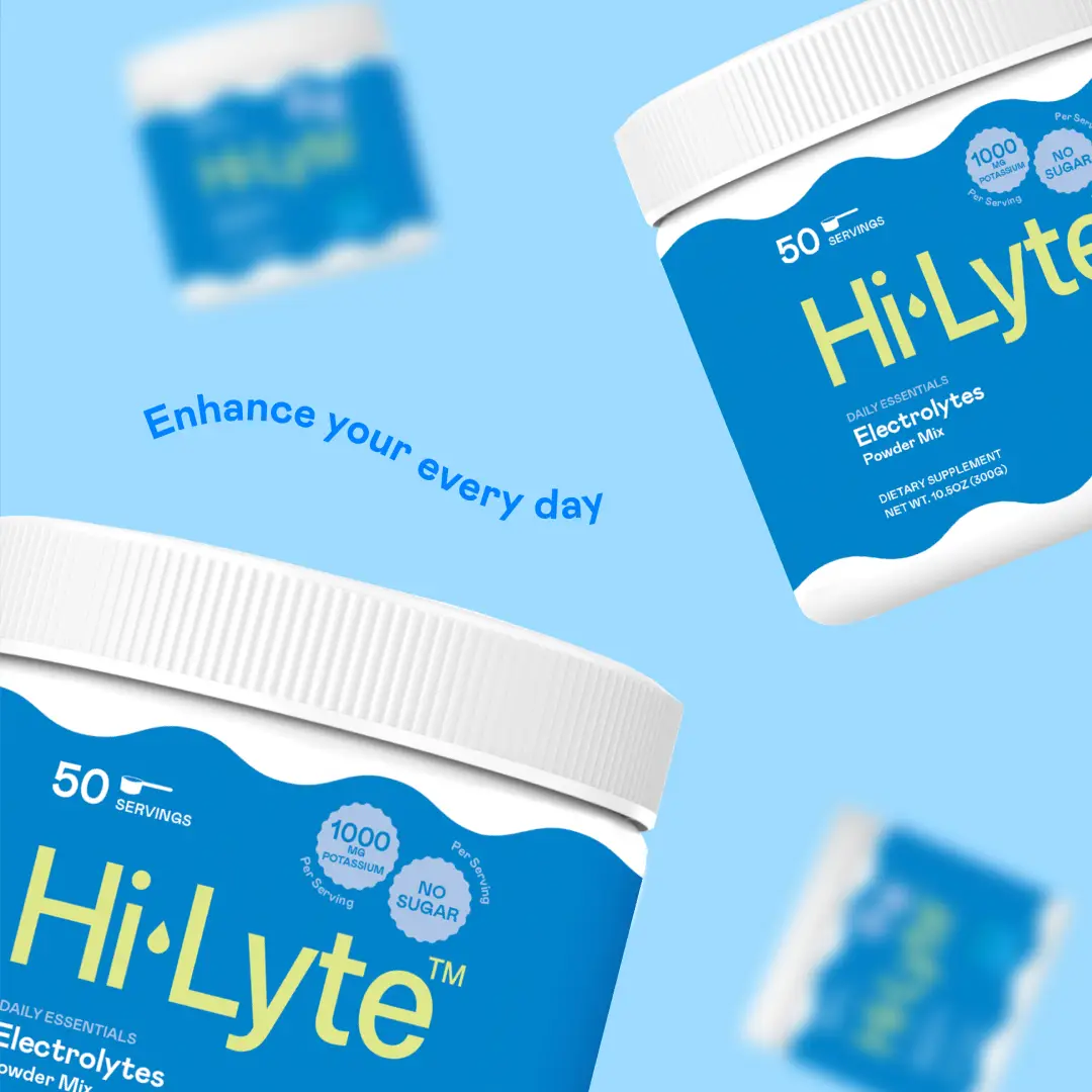
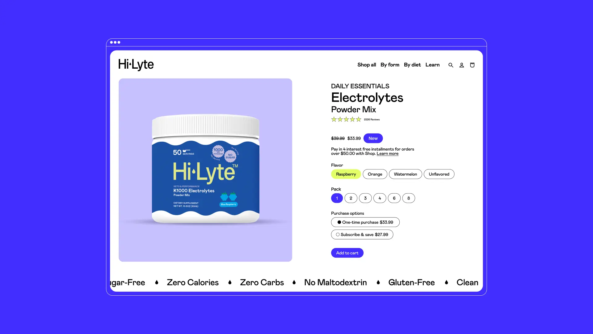
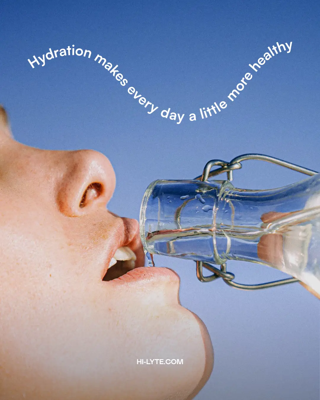
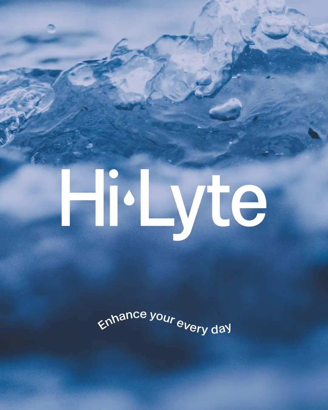
We created a brand system optimized for Amazon, one that stood out visually while still feeling familiar within the electrolyte category. This included a clear product naming architecture, refreshed brand identity, and packaging designed for fast comprehension and shelf impact.
The result was a more approachable, differentiated brand built to drive clarity, confidence, and conversion at scale.
Client
- Cheryl Harrop
- Carlos Moreira
- Anna Troszkiewicz
Press
- Coming Soon